The first thing you see when you leave the arrivals hall is never the country. It is the fridge magnet of the country. A keyring tower, a snow globe with a dome inside it, a tea towel printed with a statue half lion and half fish. Long before your taxi pulls out, the souvenir stalls have already told you where you are, and they have told you with one shape.
Travel enough and you start to notice that the shapes are doing the heavy lifting. Branding countries through icons is the practice of letting one instantly recognisable landmark, monument or symbol stand for an entire nation or city, so that a single silhouette carries its history, character and promise into the minds of visitors, investors and buyers worldwide. Nations rarely set out to do it. They do it anyway.
Stand in enough of their queues and the shapes start to teach you things.
Why does one building end up speaking for a whole country?
Because people cannot hold a country in their heads. A nation is millions of people, a dozen climates, centuries of argument. A silhouette is small enough to pack.
Stand on the Champ de Mars at dusk and you feel this in your chest. Paris has Gothic cathedrals, Haussmann boulevards, a river lined with bookstalls, and yet the shape on every postcard, perfume ad and film poster is a lattice of wrought iron that was meant to be temporary.
The Eiffel Tower was built by Gustave Eiffel’s company between 1887 and 1889 as the centrepiece of the Exposition Universelle, the world’s fair that also marked a century since the Revolution. The design is credited to two of his senior engineers, Maurice Koechlin and Émile Nouguier. Eiffel was to collect the commercial income for the fair and the following twenty years, and the tower was due to come down in 1909.
It survived because it turned out to be useful. It made an excellent antenna for radio telegraphy. That is a lesson in itself: icons are often saved by function before they are loved for form.
Then there is the bit every brand manager should frame and hang above their desk.
In February 1887, before a single rivet went in, a newspaper published a petition from artists protesting against the tower. A self-styled committee of three hundred lined up against it.
Today it is the city. The thing the elite hated became the thing the world recognised. Distinctiveness, at the start, often feels like ugliness.
The half-lion that was a logo first
Now cross to Singapore, where the order of events runs backwards, and delightfully so.
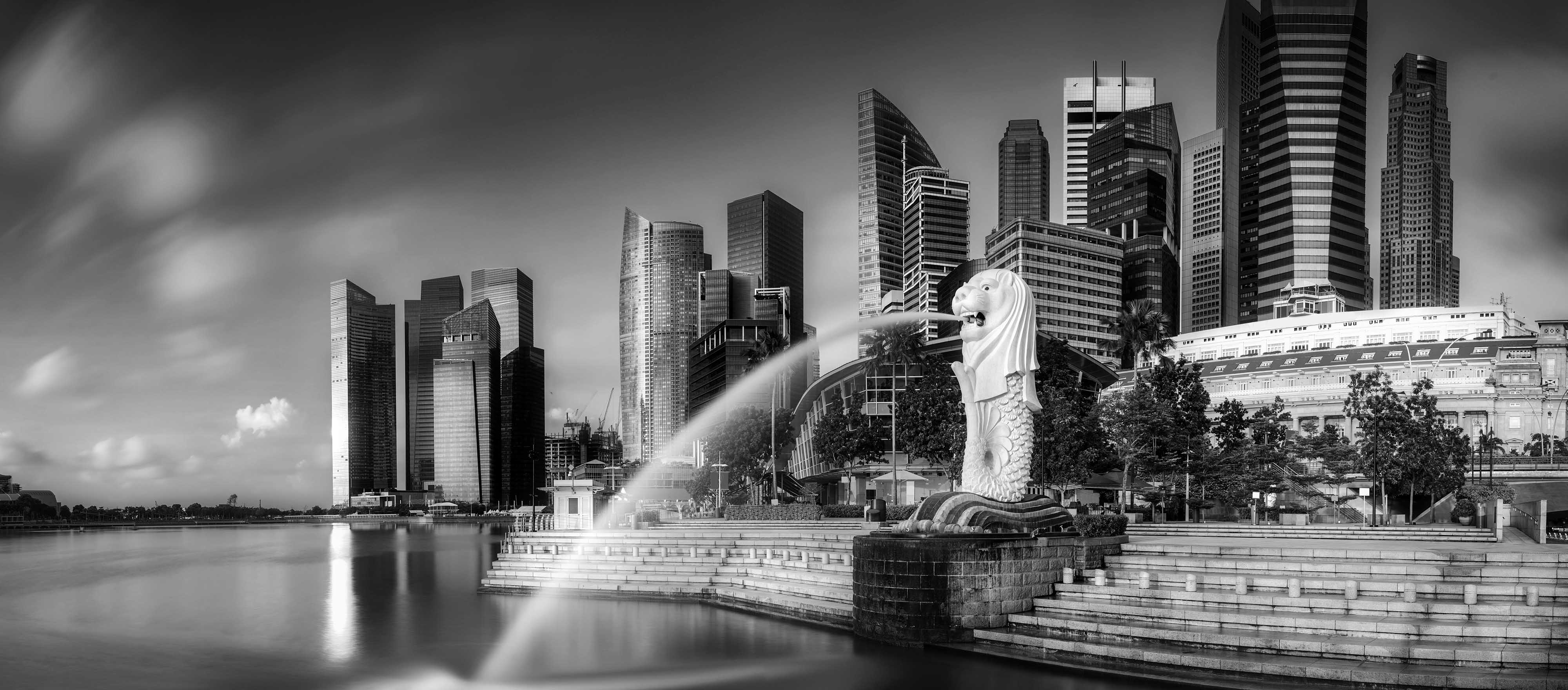
Most icons begin as buildings and only later become symbols. The Merlion began as a symbol.
Alec Fraser-Brunner, a British aquarist, designed it for the Singapore Tourism Board’s logo, which was used from March 1964 until 1997. Only later did it become something you could photograph.
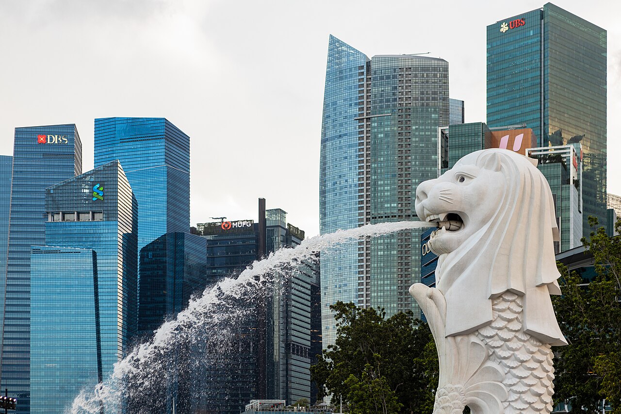
The sculptor Lim Nang Seng built the statue between late 1971 and August 1972, and Prime Minister Lee Kuan Yew officiated at its installation ceremony on 15 September 1972. It is 8.6 metres tall, it spouts water, and it was relocated in April 2002.
Think about how unusual that is. A tourism office invented a creature, put it on letterheads, and then made it real. The Merlion is less a landmark that became a brand than a brand that became a landmark.
Visitors sometimes call it underwhelming. And yet they photograph it, every single one, because that is what you do to prove you came.
Here is the paradox of national icons. They do not need to be loved. They need to be unmistakable.
The Merlion also shows how carefully a nation guards its shape. Even after the tourism board changed its logo in 1997, the symbol stayed protected under the board’s own legislation, and using it still needs official approval. A country, like a company, can own a silhouette.
A cautionary footnote: Sentosa once had a second, giant Merlion of its own, which closed in October 2019 to make way for redevelopment. Icons are not permanent just because they are big. They are permanent when they are needed.
Is a national icon more about the story than the stone?
Take the train from Delhi to Agra early, before the heat lifts off the plains, and you arrive at a building that carries more emotional freight than any campaign could buy.
Shah Jahan commissioned the Taj Mahal in 1631 for his wife Mumtaz Mahal, who had died that year. Work began in 1632; the mausoleum was finished in 1648 and the full complex around 1653. Unesco listed it as a World Heritage Site in 1983, and in 2007 it was named among the New 7 Wonders of the World.
What makes it work as a symbol of India is not only the white marble or the perfect symmetry, though both stop you dead.
It is the story. A grieving emperor. A monument to love. Visitors arrive already knowing the ending, which is precisely what a great brand story does: it travels ahead of you and greets you at the gate.
The Taj also shows the hidden cost of being an icon. Pollution has yellowed the marble since the late twentieth century, and authorities created a vast protected zone around Agra with strict emissions rules. The site now fines visitors who stay longer than three hours.
When a symbol carries a nation’s image, the nation has to manage the symbol like an asset. Fame is a maintenance contract.
The building that broke its budget and became priceless
Some icons are inherited. Others are commissioned on purpose, with a fair amount of chaos along the way.
Walk around Bennelong Point in Sydney on a bright morning and the shells of the Opera House seem to move with the light. In January 1957 a little-known Danish architect, Jørn Utzon, won the design competition. The original estimate was £3.5 million, with completion pencilled in for 1963.
It opened ten years late, in October 1973, at a final cost of A$102 million. Utzon had resigned in 1966 after clashes over the project and never returned to Australia to see it finished. He was awarded the Pritzker Prize in 2003, and in 2007 the building joined the World Heritage list.
Nobody now remembers the overrun as the headline. They remember the sails.
That is not an argument for blowing your budget. It is an argument about what lasts. A truly distinctive shape outlives the controversy that birthed it, because distinctiveness is what memory clings to.
For Australia, the Opera House did something a kangaroo could not. It said modern, confident, cultured, a country with something to say about the future rather than only the outback. Icons can reposition a nation, not merely represent it.
What can a building do that a slogan can’t?
Here is where the travel notes turn into a branding argument.
Countries spend fortunes on logos and taglines, and most of them vanish without trace. A country’s reputation is shaped far more by what it does and is than by what it says. The policy adviser Simon Anholt coined the phrase “nation brand” in 1996 and later swapped it for “competitive identity”, because governments kept mistaking the idea for advertising.
An icon sits neatly on the right side of that argument. A tower or a temple is not a claim. It is evidence. It shows engineering ambition, devotion, artistic risk, and visitors can walk up and touch it.
That is why a landmark often does more for a country’s image than any campaign line, and why campaigns that work tend to borrow the landmark rather than replace it.
Gaudí’s El Capricho, in the Cantabrian town of Comillas far from his Barcelona masterpieces, shows the same thing at village scale. Visitors treat the little villa as the town’s identity, and the town’s identity colours how they see the whole region. Iconic architecture can carry a place’s brand even when it is modest in size and off the main tourist trail.
The leaning lesson in imperfection
Pisa is my favourite proof that a flaw can become a fortune.
Construction of its bell tower began in 1173, and the soft ground below started tipping it while it was still being built. By 1990 the lean had reached 5.5 degrees and the tower was closed. Engineers spent from 1993 to 2001 adding lead weights and quietly removing soil from the high side, reducing the tilt to just under four degrees. It reopened in December 2001.
Notice what they did not do. They did not straighten it. That would have been commercially insane.
The lean is the brand. Every tourist doing the “holding it up” pose on the lawn is participating in that brand, unpaid, forever.
There is a lesson here for any business tempted to sand away its quirks in a rebrand. Before you fix the flaw, ask whether the flaw is why people remember you.
Ravens, warders and the power of ritual
Not every icon is about a shape. Some are about a performance.
The Tower of London was founded in the years after 1066, its White Tower raised under William the Conqueror. It became a World Heritage Site in 1988, and since 1990 the charity Historic Royal Palaces has looked after it. Inside sit the Crown Jewels. Outside, Yeoman Warders lead tours, and at least six ravens are kept because legend says the kingdom will fall if they leave.
Historic Royal Palaces introduces the Tower’s ravens, the living ritual that keeps a thousand-year-old icon fresh.
That legend is pure brand theatre, and it is wonderful. The ravens give the site a living ritual, something that happens every day rather than something that merely stands there. Britain’s image abroad leans heavily on this sort of ceremony: guards, uniforms, pageantry. An icon becomes stickier when it has a ritual attached, because rituals give people a reason to return and a story to retell.
When icons go modern: the Gulf and the Basque Country
The nations of the Gulf studied all of this and decided to build their icons on purpose and in a hurry.
The Burj Khalifa opened in Dubai on 4 January 2010, at 828 metres the tallest building in the world. It was designed by Skidmore, Owings & Merrill with Adrian Smith as chief architect, and renamed at its opening in honour of Sheikh Khalifa bin Zayed Al Nahyan, then President of the UAE. Its New Year’s Eve light and fireworks show, broadcast around the world, has set records for the largest LED-lit façade.
One tower, used as a screen, tells a global audience what Dubai wants to be known for: ambition at scale.
A generation earlier, the post-industrial Spanish city of Bilbao made a similar bet. Frank Gehry’s Guggenheim Museum opened in October 1997, and in its first three years almost four million visitors came and roughly €500 million of economic activity was generated.
Planners worldwide now speak of the “Bilbao effect”, though critics use the phrase with less affection, pointing to gentrification. Either way, a single building rebranded a city few travellers had ever thought to visit.
The fine print: who owns the view?
One last stop, and it is back in Paris after dark.
The Eiffel Tower’s lighting is treated as an artistic work in its own right. A French court ruled in 1990 that a 1989 lighting display was protected by copyright, and the operator treats its illuminations as copyrighted. Private holiday snaps are fine, but professional and commercial use of the illuminated tower needs permission.
Mention this to any group of photographers and you get puzzled grumbling. People ask where copyright on light ends, whether a reflection in a puddle counts, why France opted out of the broad freedom to photograph public buildings that most countries allow.
The practical answer is simpler: the rules mostly bite on commercial use. The branding answer is more interesting. A nation’s icon is valuable enough that someone will defend it, and anyone using a landmark in their own marketing should check the rules first.
What a small brand can borrow from a big landmark
You are probably not building a tower. Still, the playbook translates.
Picture a family-run kopi brand in Tiong Bahru wondering why customers remember its neighbour but not it. The answer is usually that the neighbour has a shape: a striking shopfront, a mascot, a signature cup.
The landmarks above suggest a short checklist. Own one distinctive form and repeat it until it is yours. Attach a story people can retell in a sentence, and a ritual that gives them a reason to come back.
Then protect the shape legally. And when someone calls it ugly at the start, remember the artists of 1887.
Before you book your ticket
What is an example of a country branded through an icon?
Singapore and the Merlion is a clear case: the half-lion, half-fish figure was designed for the tourism board’s logo in 1964 and only later built as a statue, unveiled in 1972.
Can a modern building become a national icon?
Yes. The Sydney Opera House opened in 1973 and became a World Heritage Site in 2007, and Bilbao’s Guggenheim, opened in 1997, transformed the city’s international image within a few years.
Do icons replace a country’s branding campaigns?
No, but they often outperform them, because a landmark is tangible evidence rather than a claim. Successful campaigns tend to feature the icon rather than compete with it.
Every great country has a shape you can carry home in your luggage; if your brand needs one, start with our brand strategy team.