Somewhere in the back of a New York taxi in 1976, a designer took a red crayon and a scrap of paper and drew the letter I, a small heart and the letters NY. He expected the job to last a couple of months. He did it for nothing. Half a century later the scrap sits in the collection of the Museum of Modern Art and the design sits on more mugs, T-shirts and fridge magnets than anyone could count.
That is the heart’s great promise to a brand. And, as we shall see, its great trap.
The heart symbol in branding is the use of the stylised two-lobed heart shape in logos, names, slogans and interfaces to signal affection, care or loyalty, borrowing a meaning the public already understands so that a brand can feel warm at a glance.
The important word there is borrowing. Nobody owns the heart. Everyone can rent it.
Where did the shape come from?
Not from anatomy. A real heart looks like a fist wrapped in plumbing, and medieval artists knew it. The tidy shape we draw today grew out of foliage: in medieval heraldry and illumination, heart-like outlines usually depicted ivy and water-lily leaves.
The first known picture of a heart as a symbol of romantic love dates to the 1250s, in a French manuscript called the Roman de la poire, and even that one is disputed by scholars. By the late fifteenth century the indented red heart had settled on playing cards, where it still is. The nineteenth century put it on Valentine’s Day cards. Somewhere along the line it stopped being a leaf and became a feeling.
There is a romantic modern theory that the shape comes from the seed of silphium, an extinct plant the ancients prized. It is a lovely story. It is also speculation, proposed only from the 1960s onwards, with no continuous line of evidence. Brand people should take note: a good origin story spreads faster than a true one.
The taxi, the crayon and the verb
Back to that taxi. The designer was Milton Glaser, and the campaign was commissioned by William S. Doyle, deputy commissioner at the New York State Department of Commerce, through the agency Wells Rich Greene. It launched on 15 July 1977 to bring tourists to a state, and especially a city, that badly needed good news.
What Glaser did was small and enormous at once. He turned a symbol into a verb. “I ♥ NY” asks the reader to do a little work, to translate the shape into the word love, and that tiny act of decoding is part of why it sticks. You do not read the logo so much as say it in your head.
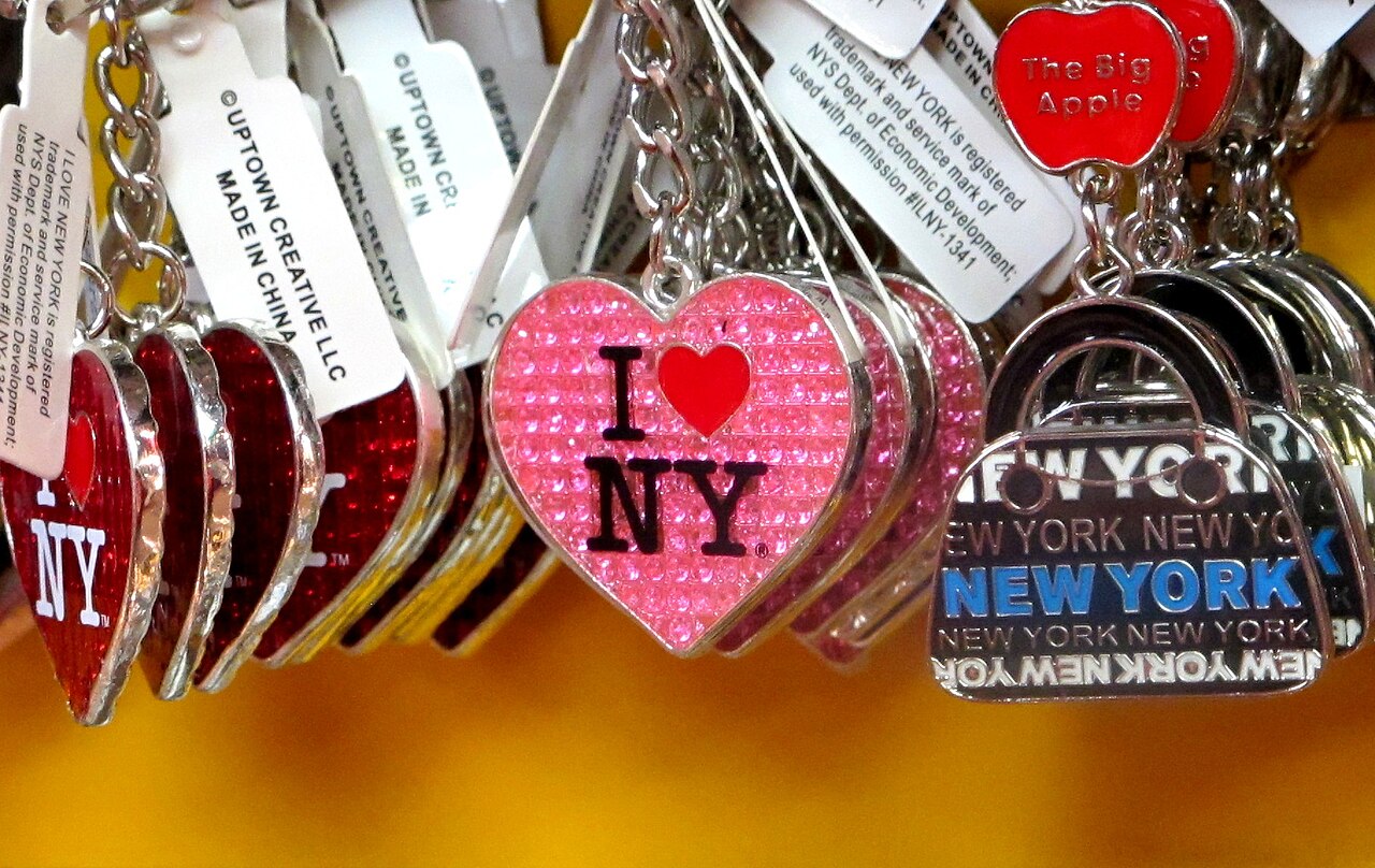
The letters are set in American Typewriter, a rounded slab serif with the warmth of a manual keyboard. The heart is plump, red and slightly heavy. There is nothing clever about any single part. The cleverness is in the sentence.
After the attacks of September 2001, Glaser redrew it as “I Love NY More Than Ever”, with a small scorched mark on the heart to stand for the site of the World Trade Center. It was sold as a fundraiser. A logo designed to sell weekend breaks had become a way for a city to talk about grief.
Then came the copies. Thousands of them.
Why is the heart symbol so hard to own?
Because the more successful it is, the more it belongs to everybody.
New York State owns the I ♥ NY mark and has filed close to 3,000 objections against imitators over the years. It has not stopped “I ♥ my dog”, “I ♥ Paris” or the endless souvenir-shop variations, because the formula itself, I + heart + place, became public grammar. Even a radio giant borrowed it: in 2014 Clear Channel Communications renamed itself iHeartMedia after its iHeartRadio platform, a company once named after AM radio stations now wearing a valentine.
This is the strange economics of the heart. The symbol does not tell a customer who you are. It tells them how you want to be felt about. And since every brand wants to be loved, the shape on its own carries almost no distinctiveness at all.
Glaser died in June 2020, on his 91st birthday, and the online conversation that followed kept circling the same paradox. The original works because it is nonsense until you complete it. The copies mostly fail because they skip that moment of completion and simply paste a heart where a verb should be. Imitation took the shape and missed the joke.
The lesson for anyone sketching a heart into a logo is blunt. You will not own the shape. You can only own a particular way of drawing it, in a particular context, with a particular story behind it.
The heart as a hidden ingredient
The cleverest heart logos do not look like hearts at first. They tuck the shape inside something else, so that the brand gets the warmth without the greeting-card cliché.
Take Airbnb. In July 2014 it unveiled the Bélo, a looping symbol by the London consultancy DesignStudio. It fused four ideas: people, places, love and the letter A.
The internet’s response was swift and merciless. Commenters said it looked like a paperclip; meme-makers compared it to parts of the human anatomy that are not usually mentioned in brand guidelines.
A decade on, almost nobody laughs. The Bélo is simply Airbnb, sitting on phone screens around the world with reassuring familiarity.
What looked like an embarrassing heart-ish squiggle became a distinctive asset precisely because it was not an off-the-shelf heart. The love was in there. You just had to be told.
Lazada did something similar in Southeast Asia. In June 2019, in its first rebrand for five years, the Singapore-headquartered marketplace introduced a new heart logomark, created with Superunion, that turns into the letter L when you rotate it. The launch campaign invited shoppers to “go where your heart beats”. For an e-commerce company competing on price and delivery, a heart was a bid for something stickier than a discount code: affection, and a younger, more colourful face.
Lazada’s "Go Where Your Heart Beats" film, the campaign that launched its heart-shaped L logomark.
Both cases follow the same pattern. A brand-specific heart, fused with a letter or an idea, can be owned. A plain heart cannot.
Care, credibility and the health aisle
Health is the heart’s most literal home, and the place where it carries the most risk.
When CVS Caremark became the first big American pharmacy chain to remove tobacco from its shelves in 2014, it also renamed itself CVS Health. The rebrand, by Siegel+Gale, was built around a heart as a universal symbol of the company’s purpose. Here the heart did real work, because it arrived alongside a decision to give up tobacco sales. Customers could see the gesture behind the glyph.
Compare the Australian Heart Foundation Tick. For around 26 years, from about 1989, a tick on food packaging told shoppers that a product met the foundation’s standards. At its height more than 2,000 products carried it.
Then the criticism mounted: the tick appeared on pies, pizzas and certain McDonald’s meals, and the foundation’s sponsorship ties to fast-food partners damaged its credibility.
In December 2015 the foundation decided to retire it in favour of the government’s Health Star Rating. New Zealand phased out its version in 2017.
There is the heart’s double edge in a single aisle. It borrows trust. When the trust is not repaid, the shape makes the betrayal look worse, because it promised care.
In Singapore, the Singapore Heart Foundation has worked against cardiovascular disease since 1970, with a gentle line, “Your Heart We Care”, that tells you exactly who it is for. A health charity can use the heart literally because it is literally about hearts. Most brands cannot claim that excuse.
The smallest heart that changed communication
In the 1990s, NTT Docomo in Japan sold a pager that let users send a small picture alongside their text: a heart. Young people adored it. When the company launched a newer, business-minded model without the heart pictogram, users complained loudly and many switched to rival providers that offered one. Docomo reversed the decision and brought the heart back.
Shigetaka Kurita, who later designed Docomo’s set of 176 pixel pictograms for its i-mode mobile service, said that episode convinced him and his colleagues that symbols had to be part of the future of texting. Those pictograms, among the earliest emoji to be widely used, are now in the collection of the Museum of Modern Art, a short walk from Glaser’s crayon sketch.
The red heart is now one of the most used emoji in the world. Any brand that puts a heart in its interface is speaking a language its customers already type every day.
Hearts in the interface
That fluency explains why platforms keep reaching for the shape. Until November 2015, Twitter users “favourited” tweets with a gold star. Then the star became a heart and favourites became likes, a change the company made to match other networks and reduce confusion. Facebook added a “Love” reaction to its thumbs-up a few months later, in February 2016.
The heart in a user interface is a different creature from the heart in a logo. It belongs to the user, not the brand. It is a button for feeling, and its success depends on being instantly understood across languages, which is exactly what a plain heart does best.
Tinder, by contrast, kept a flame as its logo and made “swipe right” its verb. That is a useful reminder that the heart is not compulsory, even in the business of romance. A dating app that leans on fire instead of hearts tells you something about the kind of feeling it wants to sell.
When the heart becomes the face
In fashion, the heart can become a whole personality. Comme des Garçons, founded in Tokyo by Rei Kawakubo, launched its PLAY line in 2002 with a heart wearing a pair of goggle eyes, drawn by the Polish artist Filip Pagowski. It had originally been sketched for another project and went unused, until it resurfaced as PLAY’s emblem.
The genius of that heart is the eyes. Without them, a red heart on a T-shirt is a souvenir. With them, it is a character with an attitude, cheeky and a little odd, which fits a label better known for avant-garde shapes. The heart has been everywhere since, including on collaborations with Converse, and it has made a cerebral Japanese label approachable for plenty of people who will never buy a sculptural jacket.
Korean pop culture added another twist: a heart you make with your hands. The finger heart, a pinch of thumb and forefinger, spread through South Korea in the 1990s and was carried abroad by K-pop and K-drama stars as a gesture of thanks to fans. In 2021 it became an official emoji. It is the heart as body language, and for any brand selling into young Asian audiences it is a reminder that the symbol now lives in gestures as well as graphics.
So should your brand use a heart?
Picture a family-run bakery in Tampines deciding on a new logo. The owner loves hearts. Her customers love her. A heart seems obvious.
It is obvious. That is the problem. A plain heart will make the bakery look like every other bakery, clinic, charity and dating app on the high street. If she wants one, she has to make it hers: fuse it with a loaf, a letter, a local motif, draw it with her own hand, or give it a face.
A few honest tests help.
Is love really your promise? If your brand is about care, health, community or devotion, a heart is natural. If it is about speed, precision or price, the heart may sound sweet and say nothing.
Can you draw it differently? If your heart could be swapped for clip art without anyone noticing, it is not working hard enough.
Will your behaviour back it up? The heart is a promise of care, and customers audit promises. CVS put a real decision behind its heart. The Australian Tick lost credibility when its endorsements stopped matching what the symbol implied.
Does the heart travel? It is one of the most universally understood symbols on earth, which is a gift for brands crossing Asian and global markets. That same universality is why it is so hard to protect.
Real brand love rests on emotional connection, a long relationship, passion that shows up in behaviour, and the way a brand becomes part of how people see themselves. None of those comes from a shape. The heart can point at the feeling. It cannot create it.
Before you draw one
What does the heart symbol mean in branding?
It signals affection, care or loyalty, using a meaning the public already understands. That makes it warm and instantly readable, but also very hard to make distinctive.
Who designed the I ♥ NY logo?
Milton Glaser designed it, reportedly sketching it in a taxi with a red crayon, for a 1977 New York State tourism campaign. He did the work pro bono, and the state still owns the mark.
Can a company trademark a heart?
A company can protect a specific heart-based logo or word mark, such as a particular drawing combined with a name, but not the heart shape itself. The more generic the heart, the weaker the protection.
If you want a symbol your customers can love without mistaking it for everyone else’s, that is the kind of identity work we do in brand consulting.