Brand consistency has an image problem. Mention it in a meeting and people picture a brand police officer with a colour fan, confiscating off-palette slides and tutting at fonts. No wonder the idea gets resisted, then quietly dropped by the third campaign.
The real thing is far more useful. Brand consistency is the discipline of making every encounter with a brand express the same core meaning and the same few recognisable cues, so that people can identify it instantly and trust what it will do, wherever they meet it.
Notice the words missing from that definition: identical, rigid, uniform, unchanging. Those belong to the myths, and seven of them deserve taking apart.
Myth 1: Consistent means identical
The most expensive misunderstanding in branding. Teams hear “be consistent” and produce a brand that looks and sounds identical in every channel, until audiences stop seeing it at all.
Consider MTV. When it went on air in August 1981, its logo came from a young New York studio, Manhattan Design, and it ignored the corporate rulebook entirely. A big, chunky M with “TV” scrawled across it.
The M almost never wore the same outfit twice: bricks one day, flags the next, then animal print, then fruit. The shape held still. Everything inside it moved. Viewers knew it anyway.
Google plays the same game on a grander scale. Its first Doodle, on 30 August 1998, put the Burning Man logo in place of the second “o”, an out-of-office note from two founders heading to the desert. More than 5,000 Doodles later, the wordmark gets redecorated constantly and nobody has ever mistaken the page for anyone else’s.
Busted. Consistency lives in the meaning and a handful of anchors. Hold those still and the rest is free to play.
Myth 2: A global brand serves the same menu everywhere
Each year, in the run-up to Chinese New Year, McDonald’s in Malaysia, Singapore and several other Asian markets brings back the Prosperity Burger: black pepper sauce, onions, an oblong patty. It was created in Malaysia in 1994 and would baffle a diner in Ohio. Yet nobody eating one wonders which company made it.
IKEA showed the same nerve in Hyderabad, where its first Indian store opened in August 2018. The famous meatballs came in chicken and vegetarian versions instead of beef or pork. Biryani joined the menu of a 1,000-seat restaurant, and the shelves carried masala boxes and tawas alongside the Swedish range. The store was still unmistakably IKEA.

Kit Kat in Japan has gone further than either. Since arriving there in 1973 it has produced more than 400 flavours, from melon in Hokkaido to purple sweet potato in Kyushu. It helped that the name sounds like kitto katsu, roughly “you will surely win”, which gave a chocolate bar a good-luck meaning and fed a national craze.
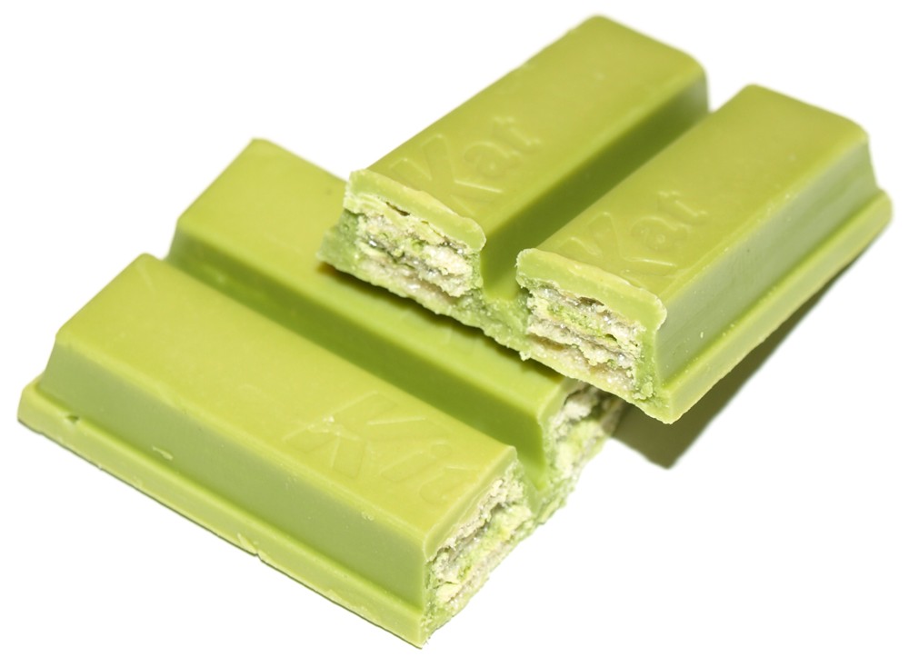
Busted. Adapt the product to the place. Keep the cues that tell people whose product it is.
Myth 3: Customers are as bored with our brand as we are
They are not. You see your logo on every slide, invoice and lanyard, all day, every day. Your customers glimpse it for a second or two, a few times a month, while thinking about something else entirely. Brand fatigue is an inside job.
Tropicana found this out the hard way in 2009. PepsiCo redesigned the North American packaging of its biggest juice brand and stripped away many of the cues shoppers relied on to find it on the shelf. Sales fell by around a fifth within two months, and the old packs came back.
The itch to refresh usually arrives with a new marketing director, a new agency, or a long afternoon staring at the same brand book. Scratch it rarely. Campaigns are routinely retired after a few weeks when they need years to sink in, and colours, characters and taglines take longer still.
Busted. Your boredom is not market research. By the time you are sick of an asset, customers have probably only just learnt it.
Myth 4: Consistency is the design team’s job
Consistency rarely breaks in the design studio. It breaks at the handovers: the franchisee printing their own posters, the sales team’s homemade deck, the supplier who “improves” your artwork, the new agency with a point to prove.
Picture a Toa Payoh pizzeria that sends its logo to a box printer. The designer there, trying to help, moves the cartoon chef in front of the oval, straightens the curved lettering and shrinks the name.
Nobody asked. Nobody checked. Ten thousand boxes later, the shop’s most visible advertising looks like a cousin of the brand rather than the brand.
Scale that up and you get Burger King after “Have It Your Way”. The line, launched in the mid-1970s, gave the chain a clear point of difference. Then came roughly two decades of false starts as presidents, marketing directors and agencies rotated through, each arriving with fresh ideas. One 1985 campaign, built around a character called Herb who had supposedly never tasted a Whopper, cost $40 million and was pulled after about three months.
Busted. Consistency is a management habit, not an artwork file. It needs an owner with authority across departments, not a PDF lost in a shared drive.
Myth 5: Breaking your own rules breaks the brand
In 2011 Coca-Cola’s team in Australia did something that should have been unthinkable. It swapped the famous Coca-Cola script on its bottles and cans for the 150 most popular first names in the country, set in a new typeface inspired by that script. Share a Coke reached more than 70 countries within three years.
It worked because so much else was already fixed in people’s heads. The red, the white lettering and a typeface that echoed the script did the identifying. Shoppers read the pack as Coke before they read the name on it.
That privilege took decades of dull, disciplined repetition to earn. A brand whose colours shift every season cannot take its logo off the pack. It just turns anonymous.
So before approving any rule-breaking idea, ask one question: which two cues will still be visible? If nobody can name them, the idea is not bold. It is invisible.
Busted. Rule-breaking is a reward for rule-keeping.
Myth 6: Consistency means never changing
The mirror image of myth 1, and just as damaging. Brands that freeze end up as museum pieces. The skill is choosing what must never move, then letting everything else evolve on purpose.
Singapore Airlines is the purest case. Its sarong kebaya, first worn by cabin crew of the airline’s predecessor in 1968 and refined by the Paris couturier Pierre Balmain, has barely changed in more than half a century. The Singapore Girl was famous enough by 1994 to earn a wax figure at Madame Tussauds in London.
Aircraft, cabins and advertising have been reinvented around her many times. The uniform stays.
MTN, the African telecoms group founded in 1994, shows the art of changing carefully. In February 2022, repositioning itself from telco to technology company across its 18 markets, it simplified its logo to black lettering inside an oval. It kept the sunshine yellow it had owned since 2004. The cue customers leaned on most stayed exactly where it was.
Even Tiffany needed time. Its 1845 Blue Book wore a cover greener than today’s shade, and the blue wandered until the 1960s before settling. It was trademarked in 1998 and later standardised as 1837 Blue, named after the founding year.
Busted. Decide what is sacred, guard it fiercely, and refresh the rest deliberately.
Myth 7: Small businesses can worry about it later
Small brands need consistency more than big ones, because they have less money for repetition. A multinational can afford to waste impressions. A three-person consultancy whose logo, website, social profiles and pitch deck look like four different companies cannot. Buyers who meet four versions of you assume four standards of care.
Picture a Tampines bakery with a hand-drawn logo on the shopfront, a different one on its boxes, a third on its delivery-app listing, and a social media voice that swings from formal to cheeky depending on who posts that day. Each piece is fine. Together they make the bakery forgettable.
The fix costs almost nothing: one logo file, two colours, one typeface, a paragraph on how you sound, and the discipline to use them every single time.
Start where customers look most often. For a café that is the cup, the shopfront and the delivery-app listing. For a consultancy it is the proposal, the website and the founder’s LinkedIn page. Fix those first and the rest can follow at leisure.
Busted. Consistency is the cheapest brand-building tool a small business has.
What should a brand never change?
Think of a brand as a signal. Every time people meet the same meaning carried by the same cues, the signal gets clearer. Clear signals become believable ones, and believable brands feel less risky to buy from. Change the signal every season and you start again from zero. And pay for it.
So sort everything into three tiers.
- Fixed: the core promise, the name, the logo and three or four other distinctive assets, such as a colour, a shape, a character, a sound or a recurring phrase. These change by board decision, rarely, and in small steps.
- Flexed: layouts, photography, campaign ideas, seasonal products, local menus. These change freely within agreed rules.
- Free: social content, collaborations, stunts, Doodle-style play. These change whenever they can earn attention, provided the fixed tier stays visible.
Most organisations get the proportions backwards. They police the free tier to death while the fixed tier quietly drifts.
How strict should brand guidelines be?
Strict at the core, relaxed at the edges. Guidelines that try to govern every social post get ignored. Guidelines that say nothing about logo spacing will get you a squashed logo on a lanyard.
Templates beat rules. A locked slide master, a few social post layouts and a correctly sized logo pack prevent more mistakes than a hundred pages of dos and don’ts, because people follow the easy path, not the documented one.
A practical test: hand your guidelines to a freelancer who has never met you and ask for a poster. If the result is recognisably yours and still feels fresh, the rules are about right. If it is off-brand, tighten the fixed tier. If it is a lifeless copy of the template, loosen everything else.
Then audit. Twice a year, spread six months of output across a table, from ads and invoices to store signs and slide decks, and look for the strangers. Every item that could belong to another company is a leak worth fixing.
Straight answers
What is the difference between brand consistency and brand uniformity?
Uniformity makes every execution look the same. Consistency keeps the meaning and a small set of distinctive assets constant while formats, content and local details vary, which keeps a brand recognisable without making it stale.
How do you keep a brand consistent across franchises or multiple outlets?
Give one person clear authority over the brand, supply ready-made templates rather than long rulebooks, and check every outlet regularly against a short list of fixed elements. Much inconsistency starts with local teams improvising because the correct file was hard to find.
How often should a brand refresh its visual identity?
When the business strategy changes or the identity stops working in new channels, not on a fixed timetable. Keep the assets customers already recognise and change the rest.
Someone has to guard the fixed points without strangling the fun; if nobody in your building has that job yet, our fractional brand management team can take it on.