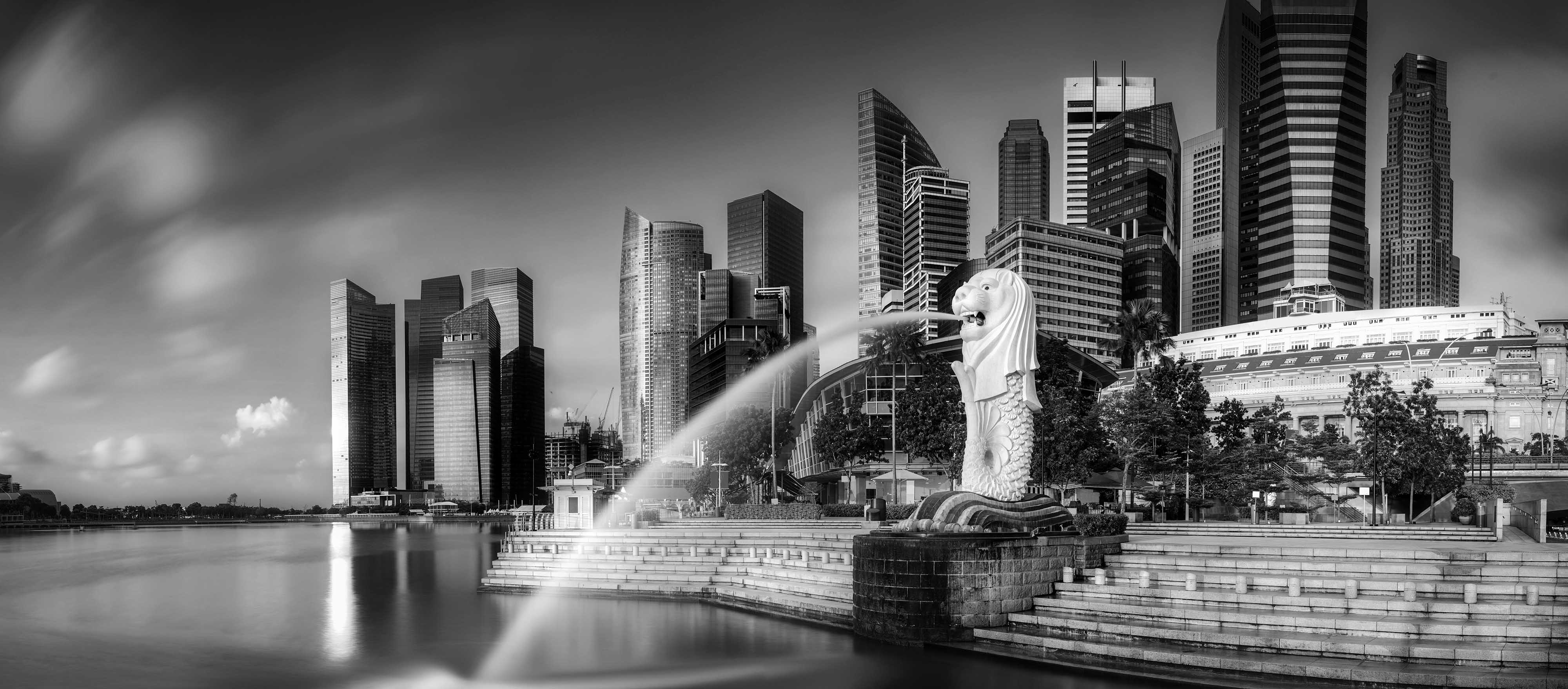
Walk the length of Raffles Place at lunchtime and you pass, within a few hundred metres, the logos of the banks most Singaporeans grew up with. Four red arrows. A Chinese sailing ship. Five red bars.
And on your phone, an app from a bank with no branches at all.
They sell remarkably similar things. Savings accounts, mortgages, cards, wealth advice, all under the same regulator and broadly the same rules. In a market like that, the brand carries an unusual amount of the load.
Singapore bank branding is the way the city-state’s banks turn largely interchangeable, tightly regulated products into distinct promises, using symbols, names, slogans, service and digital experience to signal trust, heritage and relevance to particular customers.
Here is how the main players do it, and what the newcomers are betting on.
Why does bank branding matter so much in Singapore?
Two reasons. Concentration and trust.
The market is dominated by three local groups, DBS, OCBC and UOB, alongside large foreign banks and a handful of digital entrants licensed by the Monetary Authority of Singapore (MAS) in late 2020. Switching a main bank account is a chore, so many customers stay put for years. When they move, it tends to be for a life event, a better rate, or a bad experience.
Trust is the other reason, and it is fragile in a way that makes banking unlike most categories. A shampoo brand that disappoints loses a sale. A bank that disappoints can lose a customer’s savings, or at least their sleep. So every bank brand in Singapore is, underneath the creative work, a claim about reliability.
Financial brands that stall short of greatness tend to share familiar weaknesses. They are anchored in their past. They put financial results ahead of brand measures, lack leadership support, are poorly differentiated, and run cultures that do not reinforce what the brand promises. Singapore’s banks have spent two decades trying to avoid each of those traps, with mixed results.
DBS: from development bank to “Live more, Bank less”
DBS began on 16 July 1968 as The Development Bank of Singapore, created to take over industrial financing from the Economic Development Board. Its logo, launched in 1972, shows four inward-pointing red arrows modelled on the caissons of the old DBS Building on Shenton Way. It is one of the few bank marks in Asia with a literal architectural origin story.
The name became DBS Bank in July 2003, shedding the “development” that no longer described a commercial bank with regional ambitions. For more than a decade after 2006, the bank positioned itself as “Living, Breathing Asia”.
Then, on 15 May 2018, it changed tack. The new brand promise was “Live more, Bank less”, rolled out across all DBS markets over two months, starting in Singapore. Piyush Gupta, chief executive from 2009 to 2025, tied the shift to smartphones, data and the sharing economy. The idea is that banking should be so simple and nearly invisible that customers get time back for the people and things they care about.
DBS’s own ethos film for "Live more, Bank less", the 2018 promise that banking should all but disappear from view.
It is an unusual promise for a bank: a pledge to be noticed less. It worked because DBS had spent the preceding years earning the right to make it.
A digital transformation programme launched in 2014 aimed to “Make Banking Joyful”. Euromoney named DBS the world’s best digital bank in 2016, and in July 2019 it became the first bank to hold the three top global “best bank” titles at once, from Euromoney, Global Finance and The Banker.
The phrase was not entirely unique. Australia’s Bankwest had also built a brand philosophy around banking less, and decided to keep it. Slogans in a crowded category tend to rhyme.
What happens when “invisible” banking becomes visible?
This is the question critics asked, sharply, during 2023.
On 29 March that year, DBS’s digital banking services, including its app and PayLah! wallet, were unavailable for most of the day; MAS called it unacceptable. Further disruptions followed on 5 May and 14 October.
On 1 November 2023, MAS barred DBS from acquiring new business ventures and imposed a six-month pause on non-essential IT changes. After the May incident, the regulator had already required the bank to hold roughly S$1.6 billion in additional capital for operational risk.
The public mood was split. Some users praised DBS’s apps as better than rivals’; others questioned the “world’s best digital bank” label and pointed out that outages hurt most in a city that leans heavily on cashless payments.
One recurring point was that POSB, with its older and lower-income customers, had built decades of trust that an outage puts at risk.
That is the hard lesson of a brand promise built on effortlessness. When banking is invisible, nobody thanks you. When it breaks, everybody notices. Tan Su Shan, who became chief executive in March 2025, inherited a brand whose strongest asset and biggest exposure are the same thing.
POSB: the people’s bank and its squirrel
POSB is the oldest name on the street. It opened on 1 January 1877 as the Post Office Savings Bank in the Straits Settlements, with a mission to serve lower-income savers. It became POSBank in 1990 and was sold to DBS in 1998 for S$1.6 billion.
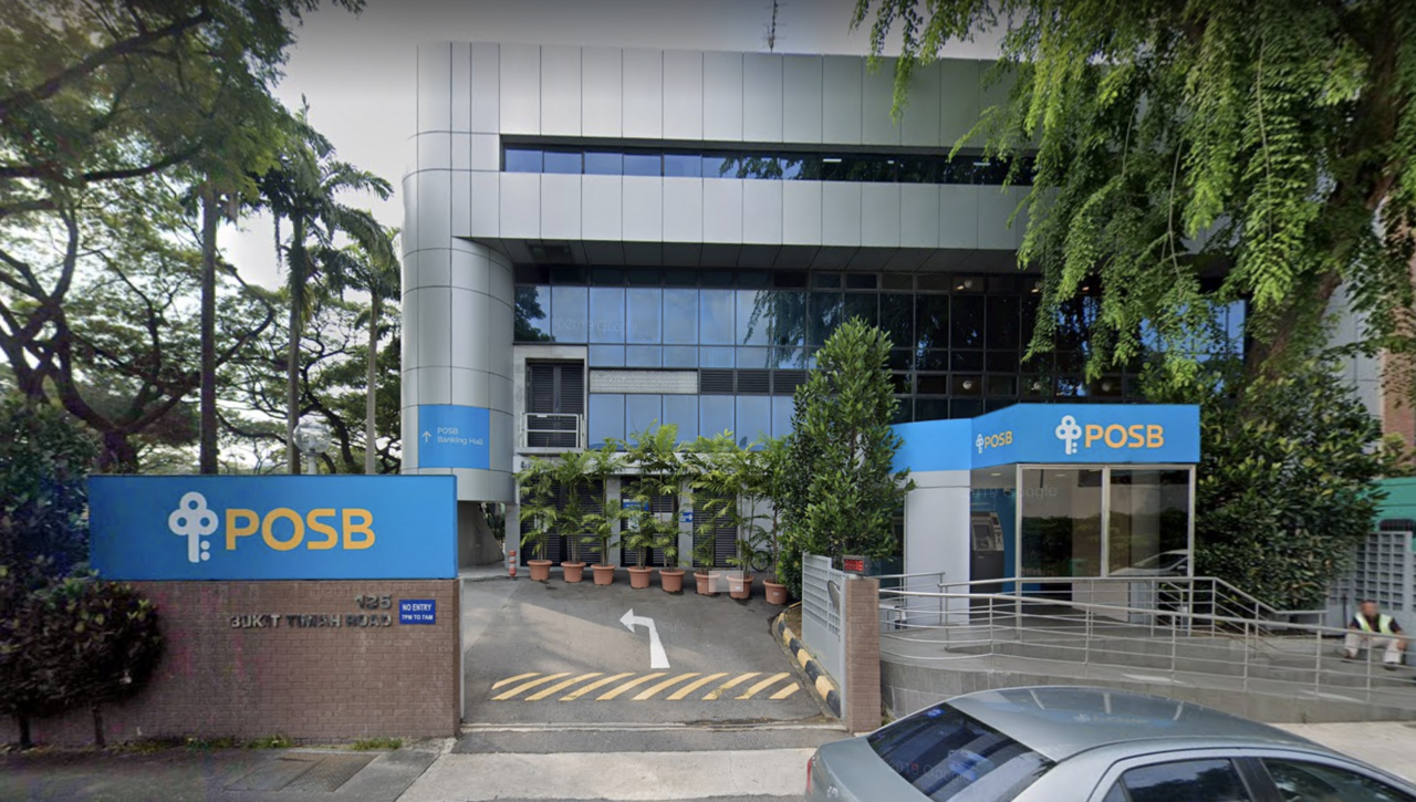
DBS made a shrewd choice. It kept the POSB name alive rather than absorbing it, recognising that the brand meant something DBS did not: neighbourhood, thrift, the bank your grandmother used. POSB describes itself as “neighbours first, bankers second”.
Then there is the squirrel. Smiley arrived in 1983, when the school savings scheme was relaunched to encourage primary school pupils to save. A creature that stores food for winter is about as on-the-nose as brand symbolism gets, which is exactly why it works with eight-year-olds.
Several generations of Singaporeans met banking through that squirrel. It is a long-term brand investment that pays out decades later, when the child becomes a customer with a salary and a mortgage.
OCBC: the ship that never left
OCBC was formed on 31 October 1932 from the merger of three banks: Chinese Commercial Bank, Ho Hong Bank and Oversea Chinese Bank. The family of Lee Kong Chian, one of the leaders of that merger, has been its largest shareholder for almost a century.
Its symbol is a Chinese sailing ship, and that ship has appeared in every OCBC logo since 1932. The bank links it to the founders’ migrant, entrepreneurial spirit: people who crossed the seas looking for better lives.
On 3 July 2023, OCBC unveiled the sixth version of its logo, the first change in about 25 years. The ship stayed. The lines were cleaned up, a custom typeface was created, and the word “Bank” was dropped, on the reasoning that the group wants to serve people beyond banking. A new tagline arrived alongside: “For now, and beyond”.
"Greater Heights", one of the brand films OCBC showcases on its own brand page.
The more important change was architectural. Subsidiaries that had carried other names were brought under the OCBC banner. OCBC Wing Hang in Hong Kong became OCBC Bank (Hong Kong); OCBC NISP became OCBC Indonesia in November 2023; mainland China followed in December.
The stated aim was to operate as “One Group” across ASEAN and Greater China, capturing trade, wealth and investment flows between the two.
OCBC’s brand has also been tested by a crisis. In December 2021, nearly 470 customers lost a combined S$8.5 million to an SMS phishing scam in which fraudsters impersonated the bank. In January 2022, OCBC announced full goodwill payouts to every victim. Expensive, and arguably the most effective brand spend it made that year.
UOB: five bars and doing right
United Overseas Bank began in 1935 as United Chinese Bank, founded by Hokkien businessmen led by Wee Kheng Chiang, its first chairman. It renamed itself in January 1965 to avoid confusion with a Hong Kong bank of the same name, keeping its Chinese name unchanged.
Its red five-bar logo draws on the traditional Chinese “five-bar gate” counting system and represents security and unity. For its 80th anniversary in 2015, UOB modernised the mark, introduced a corporate seal with Chinese characters, and adopted the strapline “Right by you”, rolled out first in Singapore and then across Malaysia, Indonesia, Thailand, China and Hong Kong.
In September 2022, UOB refreshed its brand again, this time to signal a stated purpose: building the future of ASEAN. The regional campaign, “Doing Right By You”, ran in seven markets.
The timing was not accidental. That January, UOB had agreed to buy Citigroup’s consumer banking businesses in Indonesia, Malaysia, Thailand and Vietnam for about S$5 billion. A bank about to absorb another bank’s customers across four countries needs a brand that explains why they should stay.
UOB also tried a separate brand for a separate audience. TMRW, a mobile-only bank, launched in Thailand in March 2019. Rather than stretch UOB’s heritage brand to fit young digital natives, it built a new one.
Maybank: a Malaysian bank with Singaporean roots
Maybank, formally Malayan Banking Berhad, was incorporated in 1960 and co-founded by Khoo Teck Puat, a Singaporean businessman. It opened branches in Singapore the same year. That history gives it an unusual standing: a foreign bank that has been part of the local scene for as long as Singapore has been independent, and longer.
Its stated mission is “Humanising Financial Services”, aiming for financial solutions that are simple and built around people. In a market where the three local banks dominate, Maybank’s brand job is to feel familiar rather than foreign.
Can digital banks build trust without branches?
This was the question hanging over the digital banks when they arrived in 2022 and 2023. Each answered it by borrowing trust from a parent brand that customers already used.
Trust Bank launched on 1 September 2022, backed by Standard Chartered and FairPrice Group. The name is a statement of intent, and the partnership is the brand strategy. FairPrice brings everyday shoppers and Linkpoints rewards; Standard Chartered brings banking credibility and its ATMs.
A household-name supermarket and a long-established international bank, together, is a reasonable answer to the question of whom to trust.
GXS Bank, backed by Grab and Singtel, began serving a select group on 31 August 2022 and opened to the public in November 2024. Its positioning targeted the underbanked: gig workers, the self-employed and early-career workers. The logic is that Grab’s drivers and delivery riders already live inside its ecosystem. The bank meets them there.
MariBank, from Sea Group, the company behind Shopee and Garena, opened to the public in March 2023 on an invite-only basis, starting with Shopee customers and sellers. In May 2025, Sea rebranded its digital financial services arm from SeaMoney to Monee. Founder Forrest Li said the name was simple and easy to write and pronounce.
All three have chosen the same play: lend the bank the trust of a brand people already open every day. Whether that trust transfers fully to deposits and loans is still being tested.
Picture a Hougang hawker who orders supplies through one app and gets paid through another. She might be happy to keep a savings pocket with the app she trusts. Her retirement money is a different conversation.
What other brands can learn from the banks
Heritage is an asset only when it is translated. OCBC kept its ship but cleaned up everything around it. UOB found a counting symbol and turned it into a story about security. POSB kept a squirrel because it still did its job.
A promise has to be operational. DBS’s “Live more, Bank less” earned admiration for years and scrutiny in a single bad spring. The slogan was never the problem. The servers were.
Crisis response is brand-building. OCBC’s goodwill payouts and DBS’s resilience spending said more about each bank than any campaign.
Architecture matters too. DBS runs two brands for two audiences. UOB built TMRW rather than stretch itself. OCBC pulled its subsidiaries under one name.
The digital banks borrowed their parents’ credibility. None of those choices is universally right, but each was deliberate.
Quick answers
What is DBS’s brand promise?
Since May 2018, DBS’s brand promise has been “Live more, Bank less”, the idea that banking should be simple and nearly invisible so customers have more time for what matters to them.
What does the OCBC logo represent?
It shows a Chinese sailing ship, which has appeared in every OCBC logo since 1932 and stands for the founders’ migrant, entrepreneurial spirit. The latest version was unveiled in July 2023.
Which digital banks operate in Singapore?
The main digital banks serving retail customers are GXS Bank (Grab and Singtel), Trust Bank (Standard Chartered and FairPrice Group) and MariBank (Sea Group).
If your brand has to earn trust in a crowded, regulated market, our brand strategy team has been doing that work in Singapore since 1998.