In 1929 René Magritte painted a tobacco pipe, glossy and brown and perfectly ordinary, and underneath it wrote Ceci n’est pas une pipe. This is not a pipe.
He was right, of course. You cannot fill it, light it or tap it out on a heel. It is a picture of a pipe, and the gap between the two is where every brand lives.
That gap is also the best way to read the whole of art history in one sitting. The history of art is the story of how people have used made images to carry meaning, signal status and shape belief, from cave paintings to conceptual works. Each movement is, in effect, a new agreement about what a picture is allowed to mean.
Brand managers make those agreements every day, under deadline. Artists have been making them for fifty millennia. It seems rude not to take notes.
The first brief was a pig
In a limestone cave called Leang Karampuang, in the Maros-Pangkep hills of South Sulawesi, Indonesia, there is a panel of dark red pigment roughly 92 centimetres wide. It shows three human-like figures gathered around a large wild pig.
Dating of the mineral crust that formed over it, announced in July 2024, puts the painting at least 51,200 years old. It is the oldest known figurative art. Also the oldest known story told in pictures.
Three figures and a pig make a scene, and a scene makes a claim: this happened, this matters, this is who we are. Someone chose the wall, mixed the pigment and spent hours on it. A brief and a production budget, long before the wheel.
Images gather people around a shared meaning. The rest of art history is a long argument about who gets to decide what that meaning is.
Who paid for the picture?
For most of recorded history the answer was simple: whoever was paying. Pharaohs, popes, princes and guilds commissioned work, and the work said what they needed it to say.
Hans Holbein’s The Ambassadors, painted in 1533 and now in the National Gallery in London, is the classic exhibit. Two well-dressed Frenchmen, the diplomat Jean de Dinteville and the bishop Georges de Selve, stand beside a two-tier shelf crowded with globes, sundials, a quadrant, a lute and a hymnal.
Every object is a credential. Look how learned we are. Look how much we own. A LinkedIn profile in oil.
Oil paint, seen this way, was a technology for rendering possessions so vividly you could almost touch them, and the people who paid for it wanted exactly that. When colour photography arrived, advertising inherited the job. The portrait showed what the sitter had. The advertisement shows a glossier future you, who has bought the thing.
There is a sting in Holbein’s tail, though. Across the bottom of the canvas floats a smeared grey shape that resolves into a human skull only when you stand at a sharp angle to the painting.
The National Gallery unpacks The Ambassadors, from the status objects on the shelf to the hidden skull.
Status is temporary. Few campaigns include their own skull. The good ones know where it is.
How did a cheap print become a global icon?
Around 1831, in Edo-period Japan, Katsushika Hokusai published The Great Wave off Kanagawa, the first image in his series Thirty-six Views of Mount Fuji. It was a woodblock print, a commercial product, and an estimated 8,000 impressions were made.
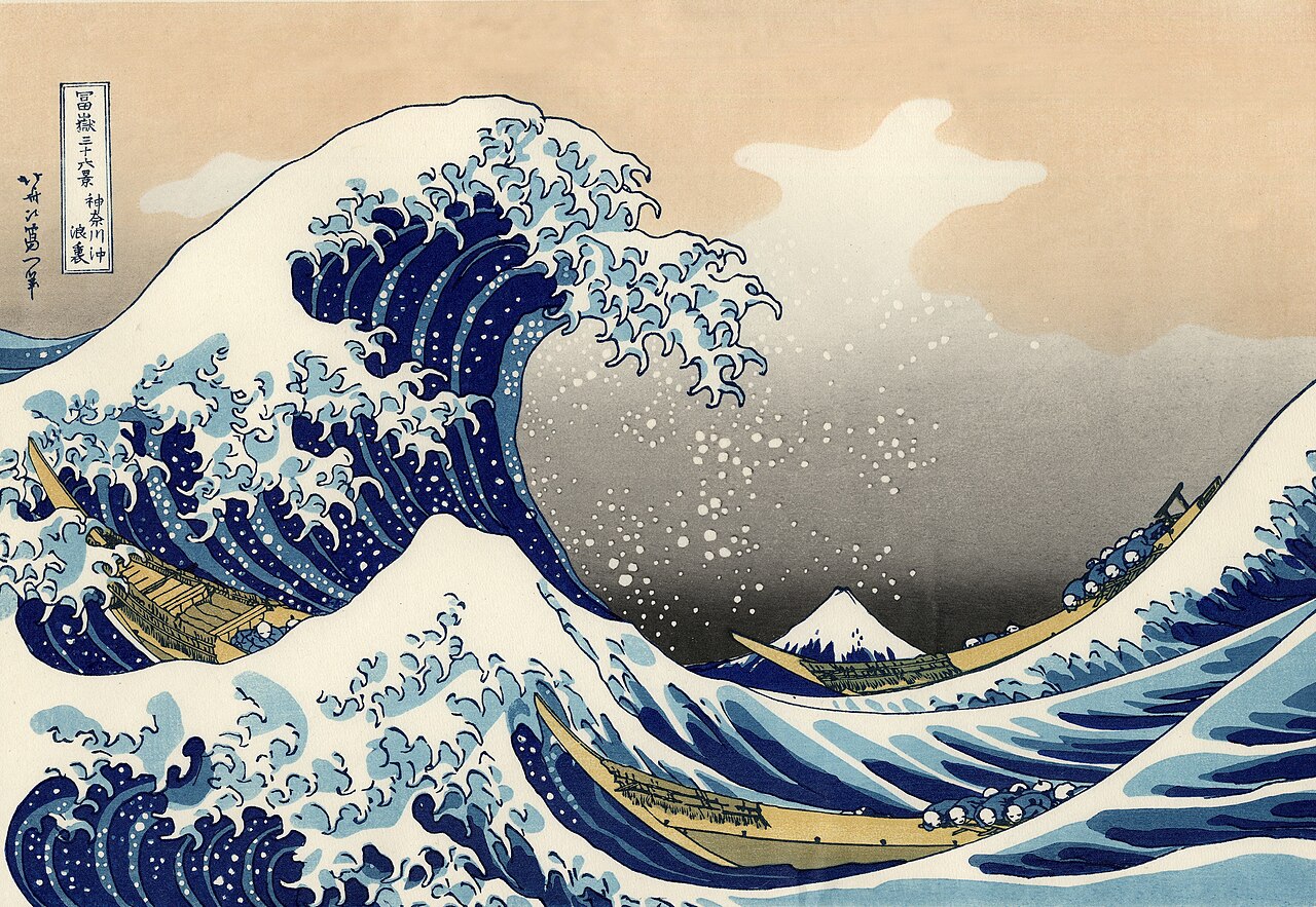
It also made bold use of Prussian blue, a pigment imported through Dutch traders that held its colour better than indigo. Hokusai was, among other things, an early adopter.
Then the world opened up. After the Meiji Restoration of 1868, Japanese prints flooded into Europe. Van Gogh wrote of the wave’s terrifying power, Monet drew on it, and Debussy put a version of it on the cover of his score for La Mer in 1905. A mass-produced object from Edo became visual shorthand for Japan itself.
It still is. Since 2024 the wave has appeared on the Bank of Japan’s new 1,000-yen note, and Apple’s water-wave emoji looks suspiciously familiar.
The lesson for brands is wonderfully unglamorous. Icons are rarely born precious. They become iconic because they are reproducible, repeated and distinctive enough to survive being printed badly on cheap paper.
An insult with excellent brand recall
In April 1874 a group of painters who kept being rejected by the official Paris Salon held their own exhibition in the former studio of the photographer Nadar. Monet showed a hazy harbour scene called Impression, Sunrise.
The critic Louis Leroy, writing in the satirical paper Le Charivari, mocked the whole lot as mere “impressionists”, unfinished sketchers pretending to be painters. The painters took the insult and wore it. “Impressionism” became a movement, then a market, then a gift-shop umbrella.
Two forces made it possible. Paint in portable tin tubes let artists work outdoors, quickly, chasing light. And photography had just made accurate copying look cheap.
So painting stopped competing on accuracy and started competing on perception: not what the harbour looked like, but what it felt like to stand there at dawn. When a new technology does your old job better, find the job it cannot do. And if the market is going to label you anyway, own the label.
On 1 January 1895, Parisians woke to a new poster for Sarah Bernhardt’s play Gismonda. Tall, narrow, golden and strange, with a halo-like arch behind the actress’s head, it made its designer, the Czech artist Alphonse Mucha, famous almost overnight.
Mucha went on to draw advertisements for JOB cigarette papers, Moët & Chandon champagne and Nestlé baby food. Same flowing hair, same floral borders. He had built a set of distinctive brand assets, then rented them out. The “Mucha style” became the popular face of Art Nouveau, which irritated him; he insisted art could never be new.
Why is a urinal considered art?
This is the question people actually ask, usually with an eyebrow raised. It is also the most useful question in this entire history.
In April 1917 Marcel Duchamp bought a standard porcelain urinal, turned it on its back, signed it “R. Mutt” and submitted it, as Fountain, to a New York exhibition that promised to show any work by anyone who paid the fee. The organisers hid it behind a partition. The original vanished soon after.
The replicas Duchamp later approved now sit in major museums. In 2004 a poll of 500 British art-world professionals voted Fountain the most influential artwork of the twentieth century, ahead of Picasso’s Les Demoiselles d’Avignon.
Duchamp proved that meaning is not inside the object. It is conferred by context: the plinth, the title, the signature, the room, the argument around it.
That is exactly how brands work. The same white T-shirt means one thing on a market stall and something else with a particular label sewn into the collar.
Magritte’s pipe made the companion point. The image is not the thing; the brand is not the product. Both statements are annoying and true.
Soup, dresses and the great borrowing loop
From the 1960s, art and commerce stopped pretending not to know each other.
In July 1962 Andy Warhol showed 32 canvases of Campbell’s soup cans at the Ferus Gallery in Los Angeles. Campbell’s sent lawyers to look into possible trademark issues, then thought better of it and sent Warhol a case of tomato soup.
In 1996 the Museum of Modern Art paid around US$15 million for the set. A grocery label became a museum treasure without changing a letter.
Traffic ran the other way too. In 1965 Yves Saint Laurent turned Piet Mondrian’s grids into a collection of wool jersey shift dresses, one of which made the cover of Vogue that year. In 1969 Salvador Dalí designed the daisy-shaped logo for the Spanish lollipop maker Chupa Chups.
Absolut Vodka commissioned Warhol in the mid-1980s and went on to work with Keith Haring, Jean-Michel Basquiat and dozens of others. The bottle became a running exhibition.
The Asian chapter is the most commercially spectacular. Louis Vuitton asked Takashi Murakami to remix its monogram in 33 colours in 2003, then released a collection with Yayoi Kusama in 2012 and a second in 2023.
Kusama’s polka dots, which she has painted since childhood and once described as a way to infinity, became one of the most recognisable patterns in luxury retail. In 2024 a limited-edition Kusama pumpkin bag sold at Christie’s for a record price for a Louis Vuitton handbag.
Does putting art on a product actually work?
Mostly, yes, and the reason is a little humbling. Show ordinary products such as cutlery or bathroom fittings alongside a work of art rather than a comparable photograph, and people rate them as more luxurious and more appealing. Marketing scholars call it the art infusion effect.
The subject matter barely matters. A painting of a burning building on a soap dispenser still made the dispenser seem classier.
People were not responding to the picture. They were responding to the idea of Art, with its connotations of excellence, rarity and taste, and that aura rubbed off on whatever stood nearby.
So art works as borrowed prestige. Borrowed prestige, like borrowed money, has terms. If the product cannot carry the association, customers notice the gap, and you have paid for a reminder of everything you are not.
The brands that do this well keep returning to art for decades, until the borrowing becomes part of who they are.
What is a US$6.2 million banana actually selling?
In 2019 Maurizio Cattelan duct-taped a fresh banana to a wall at Art Basel Miami Beach and called it Comedian. Editions sold for US$120,000. A performance artist ate the banana in front of visitors, and gallery staff simply put up a new one.
In November 2024 an edition sold at Sotheby’s in New York for US$6.24 million, including fees, to the cryptocurrency entrepreneur Justin Sun. He later ate the banana too.
Online, people asked the obvious questions. Money laundering? A joke? An NFT made of fruit?
The precise answer is stranger. What you buy is not the banana but a certificate of authenticity and instructions for installing it. The fruit is a replaceable consumable.
That may be the cleanest description of a brand anyone has written by accident. The physical product rots and gets replaced. The value sits in the certificate, the story, the name attached and the agreement among enough people that this particular banana means something.
Duchamp’s urinal, a century on, with a better publicist.
The museum as a brand in its own right
If art confers meaning, institutions confer it at scale, and cities have noticed.
In 2007 Abu Dhabi signed an agreement with France that included €400 million for the right to use the Louvre name. Jean Nouvel’s Louvre Abu Dhabi opened in November 2017 under a perforated dome of nearly 8,000 metal stars that scatters light like sun through palm leaves. In 2023 the naming deal was extended to 2047.
A brand licence between nations, in other words, where the asset is a museum’s reputation.
Singapore’s Changi Airport installed Kinetic Rain in the Terminal 1 departure hall in 2012: 1,216 copper-coloured droplets designed by the German studio Art+Com, rising and falling in choreographed shapes above the check-in queues.
Changi’s own film of Kinetic Rain: art that tells travellers what kind of airport this intends to be.
Nobody needs it to catch a flight. That is the point. Before you have even reached immigration, it tells you what kind of airport this intends to be.
What brand teams can take from fifty thousand years of art
Meaning is conferred, not contained. The urinal and the banana prove that the frame around an object does more work than the object itself. Your packaging, store, price and tone of voice are the plinth.
Reproducibility beats preciousness. Hokusai’s wave and Mucha’s posters became icons because they could be printed, repeated and recognised from across a street.
New technology changes the job, not the need. Photography did not kill painting; it pushed painting towards feeling. Expect the same as generative tools make competent images cheap. Taste, point of view and consistency become the scarce goods.
Borrowing works best as a long relationship. One artist collaboration is a stunt. Twenty years of them is an identity.
Keep Holbein’s skull somewhere in view. The image is not the thing. If the product behind the picture fails, no amount of gold leaf will save it.
Questions from the gallery bench
What is the history of art, in one sentence?
The history of art is the record of how people have used made images to carry meaning, from cave paintings at least 51,200 years old in Sulawesi to conceptual works in which the idea matters more than the object.
What is the oldest known artwork?
The oldest known figurative painting is a scene of three human-like figures and a wild pig in Leang Karampuang cave, South Sulawesi, Indonesia, dated in 2024 to at least 51,200 years ago.
Why do brands collaborate with artists?
Associating a product with art makes people see it as more luxurious, largely regardless of the artwork’s subject, a phenomenon known as the art infusion effect. Brands such as Louis Vuitton and Absolut use long-running artist partnerships to build that prestige into their identity.
If your brand’s picture and your brand’s product have drifted apart, Magritte would understand, and so would we: let’s talk about closing the gap.