Most brand manuals that need rescuing share one flaw. They were written to impress the client on presentation day, not to settle the argument between a marketing executive and a printer at six o’clock on a Thursday. That second moment is the only one that matters.
A brand manual is the working rulebook that records how a brand looks, sounds and behaves, and why: its strategy in brief, its identity elements with exact specifications, worked examples, and the process for questions, approvals and updates. Think of it as a book of rulings, each one a decision someone would otherwise have to make again.
Here is the method, in the order the work should happen. It is not the order most manuals are laid out in. That difference explains a lot.
What is a brand manual actually for?
Three jobs. It transfers decisions from the people who made them to the people who must apply them. It makes the brand reproducible by strangers, such as a new agency, a franchisee in Jakarta or a developer who joined last week. And it gives somebody the authority to say no.
A manual that does only the first job is a souvenir. One that does all three is infrastructure.
Some of the most admired manuals ever produced were infrastructure first. The New York City Transit Authority’s Graphics Standards Manual, created in 1970 by Massimo Vignelli and Bob Noorda of Unimark, existed to make subway signage consistent across a sprawling, chaotic system. It came in a 13-inch-square, three-ring binder.
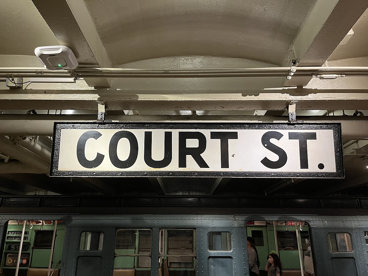
When designers at Pentagram crowdfunded a reissue in 2014, the Kickstarter set a goal of US$108,000 and passed US$800,000, making it the best-funded graphic design campaign the platform had seen. People were not paying for nostalgia alone. They were paying for clarity.
Where do you start when building a brand manual?
Step 1: Gather the evidence before you write a word
Start with an inventory, not a mood board. Collect every live expression of the brand you can find: the website, packaging, signage, uniforms, invoices, the PowerPoint template sales actually use (not the official one), social posts, email footers, the van.
Lay it out on a wall or a shared board. Look for what is consistent already and deserves protection, and for what has drifted, and why. Above all, look for decisions that were never made at all, so each team made its own.
Then talk to the people who produce brand materials every week. Ask what they get wrong, what they have to ask about repeatedly, and where they go when they are unsure. The answers are your table of contents. If the customer service team keeps improvising email sign-offs, that is a ruling the manual must contain.
Step 2: Decide who the manual is for
Teams skip this step more than any other, yet it shapes everything after it. A manual written for “everyone” is written for no one.
List your users. A typical mid-sized company has in-house designers, marketers who are not designers, external agencies, sales staff building their own decks, distributors or franchisees overseas, a web developer, and now the AI tools people feed with brand rules. Each needs different depth.
The designer wants clear-space ratios and colour values in five systems. The sales manager wants a template and three things never to do. The developer wants tokens and code. The distributor wants to know what can be localised and what cannot.
The answer is usually layers: a short core everyone reads, deeper sections for specialists, and a ready-made toolkit for people who just need to get something out of the door.
Step 3: Write the foundations before the logo page
Open with meaning, briefly. One page, perhaps two, on what the brand stands for, who it serves, how it differs and the personality it should project. Not the whole strategy deck. The distilled version a busy reader can absorb in two minutes.
This matters because every later rule needs a reason, and rules without reasons get ignored or, worse, applied mechanically where they make no sense. When a manual explains that a brand uses generous white space because it positions itself as calm and premium, a designer facing an unusual format can make a sensible call the manual never anticipated.
Singapore’s destination brand shows foundations doing work. When the Singapore Tourism Board and the Economic Development Board launched Passion Made Possible in August 2017, the logo, called the Singapore Mark, was framed as a trust mark: a signal that the country can be relied upon to deliver. TSLA Design created the identity and its global branding guidelines.
Once the idea of a trust mark is understood, a whole class of usage questions answers itself. You do not stamp a trust mark on anything careless.
Step 4: Specify the identity system, precisely
Now the elements. For each, give the rule, the exact specification, the reason, and a picture of it done right and done wrong.
Logo. Primary and secondary versions, minimum sizes for screen and print, clear space expressed as a ratio of the mark itself, approved backgrounds, and the misuses you have actually seen in the audit (stretched, recoloured, placed on busy photography).
Colour. Primary and secondary palettes with Pantone, CMYK, RGB and hex values, plus proportion guidance. A palette without proportions produces designs that are technically on-brand and look nothing like the brand. Add accessibility notes: which combinations pass contrast requirements for text.
Typography. Typefaces, weights, the hierarchy from headline to caption, fallback fonts for systems where the brand face is unavailable, and licensing notes, because someone will install the font on twelve laptops without asking.
Imagery, illustration, iconography and layout. These are where brands are most often lost. Describe the style in words, show plenty of examples, and give a grid.
Voice. Principles, a short list of words the brand uses and avoids, and before-and-after rewrites. Voice is harder to specify than colour and more often left out.
Precision has a long history here. Otl Aicher’s group at the Ulm School of Design began its systematic work for Lufthansa in 1962, building a framework that gave the airline’s crane, colours and layouts a disciplined logic.
For its 2018 centenary, Lufthansa adopted a new blue and a bespoke typeface and pushed yellow back to subtle accents. The rules changed. The habit of writing them down with care did not.
Lufthansa’s own #ExploreTheNew film from the hangar, as the 2018 blue livery was applied to its fleet.
Step 5: Show the system working
Specifications tell people what the parts are. Applications show them how the parts combine, which is where most mistakes happen.
Include worked examples for the formats your audit showed are produced most often: a social post, a presentation slide, an email, a shopfront, a trade show stand, packaging, a job advertisement. Where possible, make each one a downloadable template rather than a picture of a template.
British Rail’s Corporate Identity Manual, produced by the Design Research Unit from 1965, is a monument to this step. Its binders covered not only the double arrow symbol, designed by Gerald Barney, and the Rail Alphabet typeface by Jock Kinneir and Margaret Calvert, but architecture and signposting, rolling stock, road vehicles, ships, uniforms and stationery. The double arrow still marks National Rail today.
What should a brand manual include?
If you need a checklist, this is the core:
| Section | What it settles |
|---|---|
| Foundations | Purpose, audience, positioning, personality |
| Logo | Versions, sizes, clear space, misuse |
| Colour | Values in every system, proportions, contrast |
| Typography | Faces, hierarchy, fallbacks, licences |
| Imagery and layout | Photography, illustration, icons, grids |
| Voice | Principles, vocabulary, rewrites |
| Applications | Templates for the most-used formats |
| Governance | Owner, approvals, version, contacts |
The last row is the one most manuals leave out. It is also the one that decides whether the other seven survive their first year.
Step 6: Choose a format that can change
British Rail’s manual was issued in instalments, with new sheets added to the binders over time: the first in July 1965, the second in November 1966, two more in April 1970. Because sheets arrived piecemeal, most sets were probably never complete; the full manual only became a single 472-page book with a crowdfunded reissue decades later.
Every printed manual has this problem. It starts going out of date the day it ships.
That is why the modern manual lives online. Uber’s brand site presents the identity as a system rather than a pile of files, covering nine elements from logo and colour through motion, photography and tone of voice, with the most-requested assets close at hand.
Starbucks published a high-level creative expression guide that explains the philosophy and points readers to more detailed guides for each element. A sensible split between the why and the how.
For digital products, the manual and the code should meet. The Singapore Government Design System offers foundations such as colour and design tokens alongside ready-built components that work with React, Vue, Angular, Svelte or plain JavaScript. When the button in the guide and the button in production come from the same source, drift has nowhere to hide.
For a small business, a well-organised shared folder with a ten-page PDF and editable templates is perfectly respectable. The test is not sophistication. It is whether the newest person on the team can find the right logo file in under a minute.
Step 7: Put someone in charge
A manual without an owner decays. Name one person, internal or fractional, who is accountable for it, and write down how decisions get made: who approves new templates, how a team requests an exception, how often the manual is reviewed, and where the change log lives.
Version it. Date every revision and record what changed. When an agency asks why the green looks different in last year’s annual report, the answer should take seconds.
There is a further catch, and it is uncomfortable. In large organisations, the consistency measures used most, such as templates and access to current guidelines, are not necessarily the ones that work best. Staff also misjudge which measures matter.
The most underused lever is the simplest: managers visibly following the rules themselves. A manual is a necessary condition for consistency, not a sufficient one.
How long should a brand manual be?
As long as the decisions require and not a page more. A start-up might need twelve pages. A multinational with franchisees, sub-brands and physical estate might need hundreds, organised so that most readers see only the dozen pages relevant to them.
Length is the wrong question. Ask how quickly a user can find the ruling they need. A 200-page manual with good navigation beats a 40-page one where the colour values hide on page 31.
Step 8: Launch it like a product
Do not email a PDF and hope. Run short sessions for each user group, built around their real tasks.
Show the sales team the deck template and the three mistakes to avoid. Walk agencies through the logic behind the rules. Give developers the tokens.
Then listen. Track the questions that come in during the first three months. Each repeated question is a gap in the manual or a sign that a ruling is in the wrong place.
Big rollouts across many markets live or die on this. When MTN, the Johannesburg-headquartered telecoms group, unveiled its evolved identity in February 2022, its second overhaul since the group’s founding in 1994, the change had to land across operations in many countries at once.
Gojek faced a similar test when it unveiled a new logo in July 2019 to mark its move from ride-hailing to a wider super app. A manual alone cannot carry a change like that. Training, templates and a responsive owner carry it, with the manual as their reference.
Mistakes worth avoiding
Writing the manual before the strategy is settled, then rewriting it twice. Specifying the logo in exhaustive detail while saying nothing about photography or voice. Printing an expensive hardback that cannot be updated.
Leaving out the misuse examples because they look ugly in the presentation. Hiding the files behind a login nobody remembers.
And the most common one: treating the manual as the end of the identity project instead of the start of brand management. Picture a Jurong logistics firm that commissions a handsome identity, receives a polished PDF, and two years later finds its trucks, website and tender documents using three different greens. The manual was fine. Nobody owned it.
Before you start
What is the difference between a brand manual and brand guidelines?
The terms are often used interchangeably. In practice, “brand manual” usually describes the complete reference, including strategy, specifications, templates and governance, while “brand guidelines” can mean a shorter set of usage rules for partners.
How long does it take to create a brand manual?
For a small or mid-sized business with a settled identity, expect several weeks from audit to launch. A multi-brand or multi-market manual with templates and digital components can take a few months.
Should a brand manual be public?
Partner-facing sections, such as logo usage and downloadable assets, often benefit from being public because they reduce requests and misuse. Strategy, unreleased work and commercially sensitive details belong in an internal layer.
If your manual is gathering dust or has never quite been written, our brand consulting team can build one your people will actually open.