Pick up a piece of metal type and the first thing you notice is that it is backwards. The letter faces away from you, reversed, waiting for ink and pressure to turn it the right way round.
Typographers love that detail. Every letter you read was first made in mirror image, by someone you will never meet, for a purpose you rarely notice.
This is a short history of those people and their purposes. The history of typography is the story of how letters became reproducible objects: from carved and cast type to photographic film and digital outlines, each technology changing how fast words could travel and how much character a brand could give them.
I will tell it in ten letters. Not alphabetical. Chronological, more or less, with the odd detour.
A is for Asia, where movable type began
The European textbook story starts in Mainz. The real story starts earlier, and further east.
Around 1040, during the Northern Song dynasty, a Chinese artisan named Bi Sheng made movable type from fired clay, one character per piece, arranged and rearranged to print different pages. He tried wood as well and gave up on it; the grain soaked up ink unevenly. In 1298 Wang Zhen, a Yuan official, had more than 30,000 wooden characters cut and used them to print a county gazetteer.
Korea went to metal. Jikji, a Buddhist text printed with metal movable type in 1377, is the oldest surviving book of its kind. Then, in the 1440s, King Sejong’s court introduced Hangul, an alphabet designed to be learnt quickly by ordinary people, because Chinese characters were such a barrier to literacy.
That last point matters for brands. A script with thousands of characters makes type expensive to cut and slow to set. A small alphabet makes it cheap and fast. Europe, with its two dozen letters, was about to discover just how cheap.
B is for the Bible that made type a business
Johannes Gutenberg worked out his casting methods between roughly 1436 and 1450, and the Bible he printed in Mainz appeared around 1455. His typeface imitated the dense, black, upright handwriting of German scribes.
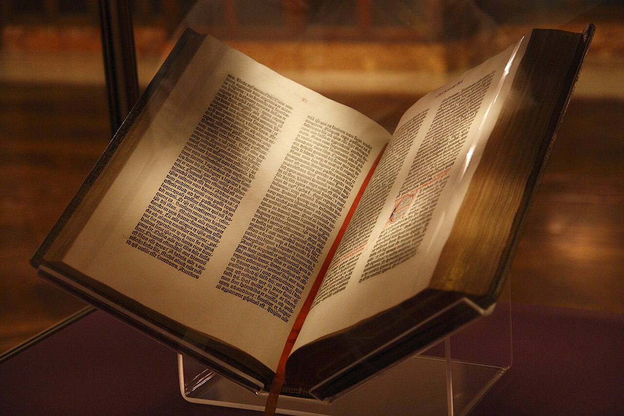
Gutenberg was not trying to look new. He was trying to look like a proper book.
Hold that thought, because it recurs throughout this history. New technology almost always disguises itself as the old one at first.
The press spread fast. One Mainz press in 1457 had become around 110 across Europe by 1480. Printing became a trade, and trades need differentiation. Within a generation, printers were competing on the look of their pages, which is to say on typography.
C is for Claude, and for the first type brand
In 1530s Paris, a punch-cutter named Claude Garamond did something quietly radical. He sold type designs as a service rather than working for a single printer. Before him, a typeface usually belonged to a shop. After him, it could be a product.
Garamond cut the Grecs du roi, the royal Greek types commissioned for Robert Estienne’s editions around 1540, modelled on the hand of the king’s librarian. His roman types, calm and open, were copied and sold across Europe for two centuries.
After his death in 1561, his punches went to buyers including Christophe Plantin in Antwerp. Today a whole family of old-style serifs carries his name, many of them only distantly related to anything he cut.
That is the first lesson in type branding. A name, once trusted, travels further than the thing it named.
D is for Dutch, then for England’s Caslon
By the early eighteenth century, English printers were importing Dutch type because nothing local was as good. William Caslon, a London engraver who had started out decorating gun barrels, changed that. From around 1725 his romans and italics, sturdy and warm, became the default for English printing and spread across the empire.
Caslon type crossed to British North America, and a version of it was used in printing the Declaration of Independence in 1776. That fact has done more for Caslon’s reputation than any specimen book.
Typefaces, like people, are judged by the company they keep.
E is for Elegance: Bodoni and the high-contrast look
In late eighteenth-century Parma, Giambattista Bodoni pushed letterforms towards drama: hairline strokes, heavy verticals, flat sharp serifs. The style, now called Didone or “modern”, was a product of better paper, better ink and better presses. It looked expensive because it needed expensive conditions to print well.
That association never left it. When a fashion house wants a wordmark that says luxury in three letters, high-contrast serifs are the shorthand. Calvin Klein and Zara have both used Bodoni-style logos. Two centuries on, the style still demands good paper, and still gets it.
F is for Futura and the typeface of its time
The twentieth century arrived and type began to argue about the future. In 1927 the Bauer foundry released Paul Renner’s Futura, built from circles, triangles and straight lines, and marketed it as the typeface of our time. Renner was not a member of the Bauhaus, but he shared its faith in geometry and function.
Futura became the voice of modernity for decades. Wes Anderson still uses it in his film titles.
IKEA’s long-time house type was based on it, which is why the 2009 switch of its catalogue to Verdana, a screen font, provoked a petition and a stern newspaper review. Readers had formed an emotional attachment to letterforms most of them could not name.
Ten years later IKEA moved again, to a customised Noto Sans called Noto IKEA, built for a global, multi-script, digital business.
G is for the grotesque that conquered the world
Sans-serifs were once called grotesques, which tells you what people thought of them. By the 1950s, Swiss designers had made them respectable.
In 1957 the Swiss Haas foundry released Neue Haas Grotesk, drawn by Max Miedinger under Eduard Hoffmann. In 1960 the German foundry Stempel renamed it Helvetica, roughly “Swiss”, for export.
Note what happened there. A typeface was rebranded with a country-of-origin name to sell it abroad, and it worked spectacularly. Helvetica went onto New York subway signs, American tax forms, airport wayfinding, corporate reports and countless logos. A feature-length documentary marked its fiftieth birthday in 2007.
Its appeal for brands was neutrality. It promised clarity without opinion. Its weakness was the same thing. When everybody speaks in a neutral voice, nobody is recognisable.
H is for house typefaces, before the word existed
Long before Helvetica, a London transport manager had grasped what type could do for an organisation. In 1913 Frank Pick commissioned the calligrapher Edward Johnston to design lettering for the Underground Group. Johnston’s sans-serif arrived in 1916, appeared on enamel station signs, and became one of the first true corporate typefaces.
It has been redrawn ever since: as New Johnston in 1979, digitised in the 1990s and 2000s, refreshed as Johnston100 for its centenary in 2016. A century on, it still says “London” before you read a single word.
The London Transport Museum on Johnston100, the centenary redraw of one of the first true corporate typefaces.
Johnston’s pupil Eric Gill drew on it for Gill Sans in 1928, carrying the London idea into the wider world of print.
Why do so many brands now commission their own fonts?
Designers and marketers ask this constantly. The honest answers are less romantic than you might expect.
Licensing comes first. A big brand might use a typeface on millions of screens, in dozens of countries, across employees, agencies and apps, and commercial licences are priced per use, per platform, per seat.
IBM used Helvetica as its corporate face for more than fifty years. In 2017 it replaced it with IBM Plex, designed in-house with the Dutch foundry Bold Monday and released under an open-source licence. Netflix stopped licensing Gotham and launched Netflix Sans in 2018 for similar reasons.
Ownership comes second. Think of a typeface as a logo you can write with. A custom face gives a brand a voice that competitors cannot buy off the shelf.
Coverage is third, and it is where Asian brands have been especially active. In 2019 Alibaba released Alibaba Sans, developed with Monotype to cover 172 languages and to stay legible both on a tiny shopping-app screen and on a building. It gave the font away free to merchants and partners, turning a brand asset into an ecosystem tool.
In Japan, LINE launched its LINE Seed typeface in 2022 and made it free to download. When your customers write in your font, your brand is literally in their hands.
What does a typeface actually say about a brand?
More than most clients expect. Less than most designers claim.
Letterforms create distinct impressions, such as reassuring, engaging or prominent, and those impressions can pull against each other. A face that feels warm and natural may feel less authoritative. A heavy condensed face reads as prominent but rarely as gentle.
The underlying dimensions are surprisingly concrete: how elaborate the letters are, how harmonious, how natural, how much flourish, how heavy, how compressed.
Go further and the effects become almost physical. Rounded or angular letterforms can shift what people expect a product to taste like. And a typeface that matches the style of a brand’s logo tends to earn a more favourable judgement.
In 1930 the typographer Beatrice Warde argued that good printing should be a crystal goblet, invisible, letting the wine show through. She was half right. Type should not get in the way. But the glass still shapes the taste.
Picture a Tiong Bahru coffee roaster choosing between a sharp geometric sans and a soft, rounded humanist face for its new bags. Same beans. Same price. The first promises precision and lab-like extraction; the second, warmth and a friendly barista.
Neither is wrong. They are different businesses, and customers will feel the difference before reading a word.
I is for interfaces, and the font that lives on glass
Once screens became the main surface for reading, typography had a new problem: tiny sizes, backlit pixels, infinite contexts.
Microsoft commissioned Matthew Carter to design Verdana for the screen, released in 1996, with generous spacing and large lowercase letters so text would survive crude displays. Apple introduced its San Francisco typeface on the Apple Watch in 2014 and made it the system font on iPhones and Macs in 2015, replacing Helvetica Neue. Its interface, product wordmarks and marketing now share one voice, tuned for glass.
For brands, this shift meant the typeface stopped living only on stationery and signage. It became the texture of every product interaction.
J is for just one file: variable fonts
The latest chapter is technical, and genuinely useful. In September 2016, Adobe, Apple and Microsoft announced OpenType variable fonts, part of the OpenType 1.8 specification. A single font file can now hold a continuous range of weights, widths or other axes, rather than a separate file for each style.
The practical gains are speed and flexibility. One file loads faster on the web than eight. A designer can set a headline at weight 640 instead of choosing between bold and black.
Apple added variable versions of San Francisco in 2020. Responsive design, where layout adapts to the screen, finally has type that can flex with it.
There is an echo of Gutenberg here. For now, variable fonts are mostly used to mimic fixed weights. The genuinely new uses (type that subtly thickens in low light, or narrows on a smartwatch) are still emerging.
What the history teaches brand owners
Read the story again and five patterns stand out for anyone choosing type today.
New technology imitates old forms before it finds its own. Gutenberg mimicked scribes; early variable fonts mimic static weights. Do not mistake the first use of a tool for its best use.
Names travel further than designs. Garamond’s name outlived his types; Helvetica’s name sold it abroad. When you commission a typeface, name it as carefully as you would a product.
Neutrality is a choice, not a default. Helvetica gave brands clarity and cost them distinctiveness. A Singapore start-up that sets everything in the same geometric sans as its competitors has chosen invisibility, whether it meant to or not.
Type carries emotional weight people cannot articulate. IKEA’s customers petitioned over a catalogue font. Few could have named Futura, but they knew something had been taken from them.
And ownership is now within reach. A custom face once demanded a London Underground budget. Today a mid-sized company can commission a modified open-source family, such as a customised Noto, for a fraction of that, and give its brand a voice nobody else owns.
Last proofs
Who invented movable type?
Bi Sheng created movable type from fired clay in China around 1040. Korea printed with metal movable type by 1377, and Johannes Gutenberg developed his metal-type press in Mainz between roughly 1436 and 1450.
When was Helvetica created?
Max Miedinger and Eduard Hoffmann released it in 1957 as Neue Haas Grotesk. It was renamed Helvetica in 1960 for international sales.
What is a variable font?
A variable font is a single font file holding a continuous range of styles, such as weights or widths. The format was announced in 2016 as part of the OpenType 1.8 specification.
Choosing type is choosing a voice, and if your brand is still speaking in someone else’s, our brand consulting team can help you find your own.