Somewhere on a wall in Pompeii, before Vesuvius buried the town in 79 AD, an anonymous hand scratched the Latin word et. The middle arm of the E ran into the stem of the t. Perhaps by accident. Perhaps out of haste.
Either way, two letters touched, and a new shape was born that would one day hold together Tiffany, Johnson, Mars, Murrie, Hennes and Mauritz.
The ampersand in branding is the use of the & symbol inside a company or product name to join founders, families, partners or ideas, signalling partnership, heritage and a crafted, merchant character while making the name shorter and more visual than the word “and”.
That definition is accurate. It also undersells the thing. The ampersand is the only punctuation mark most of us would happily frame.
A ligature that ran away from home
Start with the shape, because the shape is the story. In Roman cursive the scribe wrote E and t quickly, and over centuries the two strokes fused into a single glyph. Look at a good italic ampersand today and you can still see it: a looping E on the left, a crossed t trailing off to the right. The upright “roman” form most typefaces use is more abstract, a figure-of-eight with a tail, but it descends from the same handshake.
It had a rival. Cicero’s freed secretary Tiro devised a shorthand for Latin that included its own sign for et, a character shaped rather like a 7. The Tironian et was used for more than a thousand years and still survives in Irish, where you will see it on road signs.
The ampersand, which had no known inventor and no patron, slowly won anyway. An orphan beat the official. There is a branding lesson in that alone: the mark that spreads is the one that is easy to make and pleasant to look at, not the one with the better pedigree.
When printing arrived in Europe in the fifteenth century, compositors kept the ampersand for the same reason scribes had loved it. It saved space. It filled the line neatly. And it gave every punchcutter one character on which they were allowed to show off.
Why is it called an “ampersand”?
People ask this constantly, usually after discovering that the name sounds nothing like the thing.
In the nineteenth century, schoolchildren in America and elsewhere were taught to recite the & as if it were the twenty-seventh letter of the alphabet. Single letters that were also words, such as “A” and “I”, were recited with the Latin per se, “by itself”, so a child would say “A per se A”.
At the end of the list came “and per se and”, meaning “& by itself is and“. Said quickly by a classroom of restless children, “and per se and” slurred into “ampersand”, and by 1837 the slur had entered common English usage.
It is a lovely origin, and it matters beyond trivia. The symbol earned its name by being spoken at the end of the alphabet, which means for generations it sat on the same footing as a letter. In many minds it still does. Few marks enjoy that kind of familiarity, and few brand devices could ever hope to.
There is one myth to retire while we are here. The name has nothing to do with the physicist André-Marie Ampère. Pleasant story. Not true.
The type designer’s favourite character
Ask a type designer which glyph they most enjoy drawing and a surprising number will name the ampersand, alongside the lowercase a and g. It is hard to get right, especially in heavy weights, where the loops clog and the counters close up. And because no reader needs it to look any particular way, it is the one character where a designer is free to be personal.
The great Leipzig-born typographer Jan Tschichold took this seriously enough to collect hundreds of ampersands, from Pompeian graffiti through medieval manuscripts to nineteenth-century printing, and in 1953 published a small study tracing how the form changed. An English edition followed in 1957. It is a beautiful document of one idea moving through two millennia of hands.
For brands, this has a practical edge. The ampersand you choose says something before anyone reads the words on either side of it.
An italic, calligraphic & feels crafted, old, perhaps a little romantic. A geometric, monoline & feels engineered. A heavy, compact roman & feels solid and corporate. Swap the ampersand in a wordmark and you can shift its personality without touching a single letter.
What does an ampersand say about a brand?
The ampersand has always been a merchant’s mark. In German it is still sometimes called the kaufmännisches Und, the “merchant’s and”, and for centuries the shopfront and letterhead formula “Something & Somebody” was the default way to tell the world that two people stood behind a business.
That formula carries four meanings, often at once.
Partnership. The oldest and plainest. Procter & Gamble began in Cincinnati in 1837, when a candlemaker, William Procter, and a soapmaker, James Gamble, who had married two sisters, were persuaded by their father-in-law to join forces.
Marks & Spencer grew from Michael Marks’s penny bazaar in Leeds Kirkgate Market, opened in 1884, which he expanded into a partnership with Thomas Spencer a decade later. In both, the ampersand records a handshake that really happened.
Family. Johnson & Johnson is a curious case: three brothers founded it in 1886, yet the name joins only two Johnsons. The ampersand here is less a sum than a seal. It says kin.
Singapore’s Charles & Keith works the same way. Two brothers, Charles and Keith Wong, who had grown up helping in their parents’ shoe shop in Ang Mo Kio, opened their first store at Amara Shopping Centre in 1996.
Today the brand operates hundreds of stores in dozens of countries, and its name still sounds like two people you might meet behind the counter, which is precisely the warmth a fast-moving fashion label benefits from.
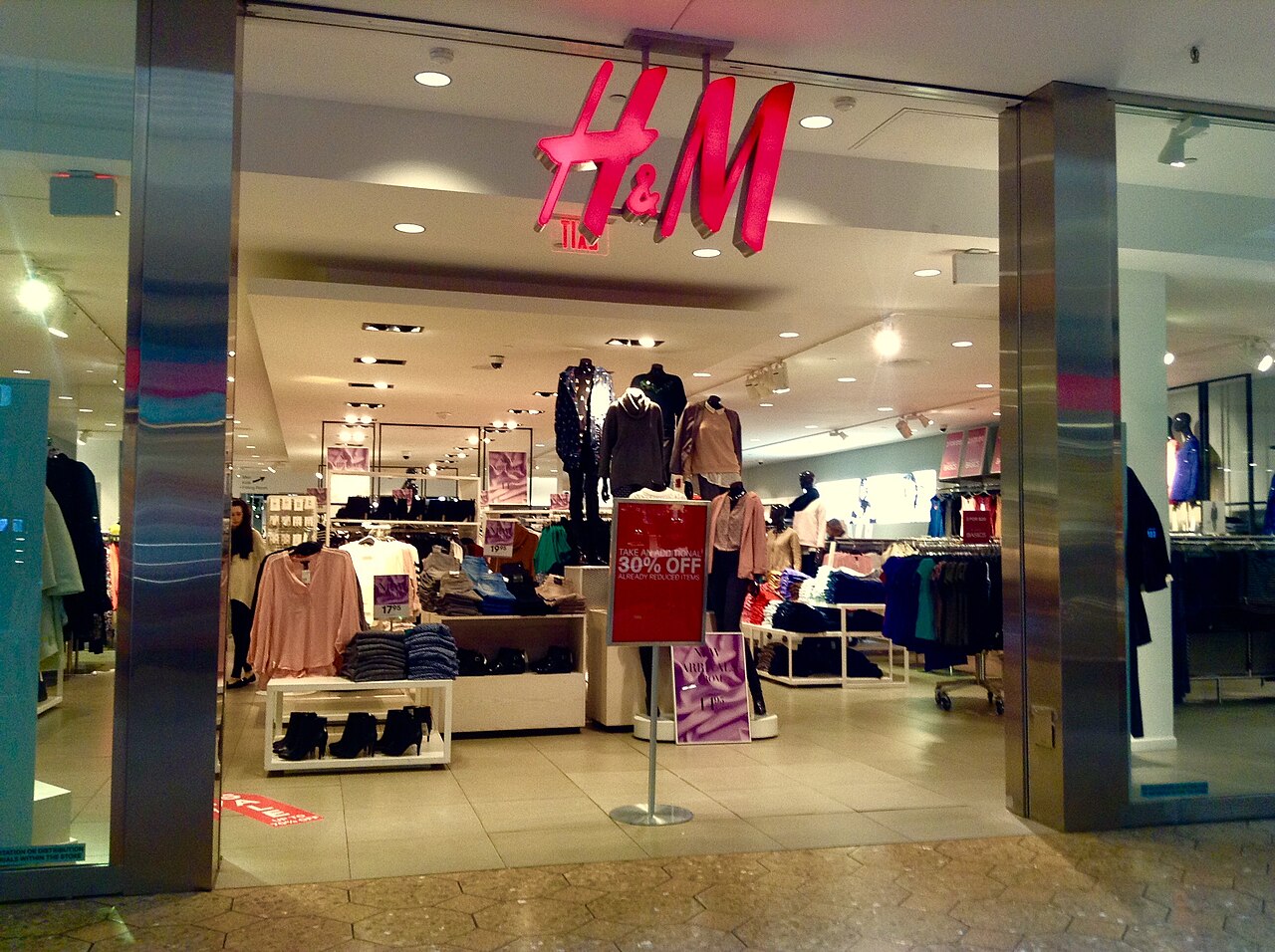
Merger. Hennes was a single women’s clothing shop in Västerås, Sweden, opened by Erling Persson in 1947; the name means “hers”. In 1968 Persson bought the Stockholm hunting-wear retailer Mauritz Widforss, added menswear and became Hennes & Mauritz. The ampersand literally stitches two businesses, and two genders of customer, into one sign.
Aspiration. Hong Kong’s Li & Fung, founded in Guangzhou in 1906 by an English teacher, Fung Pak-liu, and a merchant, Li To-ming, chose surnames whose characters suggest profit and plenty. The ampersand joins people, but it also joins wishes.
Notice what all four have in common. The & tells you there is a story with more than one character in it. A single surname announces a founder. An ampersand announces a relationship.
When the ampersand outlives its words
Then something strange happens. Over time the words on either side of the ampersand fade, and the knot remains.
Take AT&T. The company began as the American Telephone and Telegraph Company in 1885. Telegraphs have been gone from daily life for a lifetime, yet the initials and their ampersand persisted so stubbornly that, when SBC Communications bought its former parent in 2005, it adopted the AT&T name and brand for the combined company and took over the ticker “T”.
The buyer chose the purchased company’s name. That is what three characters and a knot can be worth.
M&M’s followed a similar arc. The letters stand for Forrest Mars and Bruce Murrie, and the sweets went into production in 1941. Within a decade, a printed letter m was appearing on each one.
Today almost nobody can name Murrie, and it does not matter. The ampersand turned two surnames into a compact, sayable, endlessly printable device.
Larsen & Toubro is the Indian version of the same story. Two Danish engineers, Henning Holck-Larsen and Søren Kristian Toubro, started working together in Bombay in 1938 and incorporated the company in 1946. Their surnames now belong to a giant Indian engineering and construction group, widely known simply as L&T. The founders’ Danish names have become an Indian institution, with the ampersand acting as the hinge.
This is the ampersand’s quiet gift to branding. It lets a long, descriptive, perhaps dated name collapse into initials without losing its rhythm. “AT and T” is clumsy. “AT&T” is a logo.
Should you put an ampersand in your brand name?
This is the question most people actually want answered. Picture two friends opening a bakery in Tiong Bahru and debating “Salt & Crumb” versus “Salt and Crumb” versus “Saltcrumb”. It looks like a punctuation choice. It is really a positioning choice.
Use the ampersand when:
- There genuinely are two parts. Two founders, two crafts, two ideas held in balance. The & makes the pairing feel deliberate rather than accidental.
- You want heritage or craft cues. The symbol has centuries of shopfront association behind it. Few devices buy you “established” so cheaply.
- The name will often be shortened to initials. If customers will end up saying “S&C” anyway, the ampersand gives you a better-looking monogram from day one.
Think twice when:
- Digital handling matters. The & is awkward in web addresses, email handles and social usernames, and some systems mangle it. Plan the “and” or no-ampersand version before launch, and register both domains if you can.
- Search will be important. Customers will type it three ways. Make sure all three find you.
- The pairing is not real. An ampersand between two words that do not belong together reads as affectation. Customers notice.
And always draw your own. A bespoke or carefully chosen ampersand is the cheapest piece of custom lettering in your identity, and often the most memorable.
When brands untie the knot
Ampersands also leave. In 2013 Ernst & Young officially rebranded as EY, alongside a new purpose line, “Building a better working world”. The initials had already been in informal use; the rebrand simply admitted it. For a global professional-services firm with offices on every continent, two letters travelled better than two Victorian surnames and a symbol.
An EY film built around "Building a better working world", the purpose line that arrived with the move from Ernst & Young to EY.
Johnson & Johnson went in the opposite direction. In September 2023, the company replaced the cursive script it had used for around 130 years with a new wordmark drawn in single pen strokes, and redesigned the ampersand itself, describing the new form as capturing a caring, human nature.
The founders’ names stayed. The script went. And the company chose the ampersand as the place to put its emotional message, which tells you how much meaning a single character can be asked to carry.
Sometimes the knot holds while the people pull apart. Ben & Jerry’s opened in a converted petrol station in Burlington, Vermont, in 1978; Unilever bought it in 2000, and in 2025 it became part of the spun-off Magnum Ice Cream Company. In September 2025 Jerry Greenfield left, saying the company’s campaigning voice had been silenced.
The ampersand on the tub still joins Ben to Jerry. The relationship it was drawn to represent is now more complicated. That is the risk of a name built on partnership: it keeps promising togetherness whatever happens offstage.
The & as a promise
Every symbol in a logo makes a claim. A crown claims rank. A leaf claims nature. The ampersand claims that two things belong together and that someone took care to join them well.
It is a promise of relationship, and, given its long life on shop signs, a promise of trade done face to face.
Tiffany & Co. shows how far that promise can stretch. The firm began in New York in 1837 as Tiffany, Young and Ellis, became Tiffany & Company in 1853 and was acquired by LVMH in 2021.
No one shopping on Fifth Avenue is thinking about Mr Young or Mr Ellis. They are thinking about blue boxes.
Yet the “& Co.” still whispers that this is a house, with partners and history, rather than a product. A little knot doing the work of a family tree.
Three quick ones from the type case
Where does the ampersand come from?
It began as a ligature of the Latin word et, meaning “and”, written in Roman cursive; one of the earliest known examples is graffiti from Pompeii, preserved by the eruption of Vesuvius in 79 AD.
Why do so many companies use an ampersand in their name?
It records a partnership between founders, families or merged businesses, compresses a long name into a neat monogram such as AT&T or H&M, and carries centuries of merchant and shopfront associations that suggest heritage.
Is an ampersand bad for SEO or web addresses?
It cannot be used in a domain name, and people will search for the brand with “&”, “and” or neither, so register the main variants and make sure the website and listings recognise all of them.
If you are deciding whether your name deserves a knot in the middle, start with a proper brand naming conversation.