In June 2025 the University of Warwick unveiled a new logo in a studio at its own arts centre. It was a crest. A bear, an elephant, a book and an atom, drawn by an illustrator and arrived at after asking more than 10,000 staff, students, alumni and applicants what they wanted. Ten years earlier Warwick had thrown its coat of arms away in favour of a clean, purple, very contemporary mark. Now the shield was back.
That loop tells you most of what you need to know.
The branding of universities is the deliberate management of a higher-education institution’s name, symbols, reputation and experience so that students, staff, alumni, employers, funders and governments understand what it stands for and choose it over alternatives.
It looks like corporate branding. It does not behave like it.
Why is university branding different from corporate branding?
Start with the customer. A bank customer can switch to a rival tomorrow. A graduate cannot switch universities retrospectively. The degree certificate is permanent, so the brand on it is permanent too, and alumni treat the crest as part of their own CV. That is why they fight so hard when it changes.
Then count the audiences. A consumer brand might have three. A university has at least nine: prospective students, their parents, schoolteachers and counsellors, current students, academic staff, alumni, donors, industry partners and the state. Governments in particular fund, regulate and sometimes merge universities, which no shareholder of a soap company has to think about.
Third, the product is invisible and slow. You cannot test-drive a degree. Its value shows up years later in careers and in the reputation of strangers who hold the same certificate. So applicants lean heavily on proxies: rankings, age, buildings, location, and the look of the thing.
Finally, the people who make the product are not easy to brand. Even universities with glowing external reputations struggle to get their own academics engaged, and strong overseas recognition is harder to win than most strategy papers admit. A lecturer’s loyalty runs first to their discipline, then their department, and only distantly to the marketing office’s tagline. Anyone who has tried to roll out a new email signature across a faculty knows this in their bones.
Crest or logo: which should a university use?
Most old universities now run two systems side by side. A seal or coat of arms lives on degree certificates, ceremonial maces and official documents. A simplified logo, or a stripped-back version of the crest, does the daily work on websites, social media and banners.
Read the shift carefully and it says something bigger. Detailed emblems full of books, lamps, rings and Latin are steadily giving way to abstract marks designed for quick recognition on a phone screen. The change reflects universities seeing themselves less as communities of scholars and more as organisations competing in a market, with brand guidelines, trademark lawyers and licensing departments to match. Often the new logo says almost nothing about what is taught or discovered there. That is partly the point.
The practical question is simpler. Does a symbol work small? Does it reproduce in one colour? Will it embroider on a hoodie? A crest with fourteen elements fails all three. That is the honest case for a logo.
Two shields that read like history books
The honest case for the crest is that it carries meaning nobody can buy. Look at the National University of Singapore. Its arms, adopted in 1980 and modernised in 2001, fuse two histories. The lion and open book come from the old University of Singapore. The three interlocking rings come from Nanyang University, the Chinese-medium institution founded in 1955 on land donated by the Hokkien Huay Kuan, which merged with the University of Singapore to form NUS in 1980. The rings even lost the star they once carried. Every element records a decision about who was joining whom.
Nanyang Technological University’s shield is just as literal. Granted by the College of Arms in London in 1982 to its predecessor, the Nanyang Technological Institute, it shows a lion for the institute’s links with NUS, a cogwheel for mechanical engineering, atoms for electrical engineering and a battlement for civil engineering. It is an organisation chart in heraldry. NTU kept it when it became a university in 1991, even as it grew into fields the shield never imagined.
So the answer is usually both. Keep the crest for continuity and ceremony. Build a flexible system around it for everything else. Trouble starts when a university tries to replace the first with the second.
The rebrands that came back
The pattern is consistent enough to be a rule.
By late 2012 the University of California was using a new system-wide mark: a fading yellow C sitting inside a blue, shield-shaped U, produced in-house by the president’s office. It was meant for system-wide communications, not to replace the official seal, which would stay on diplomas. Nobody heard that part. A petition passed 54,000 signatures and on 14 December 2012 the university suspended the logo. Some designers defended it. It did not matter.
The University of Exeter dropped its crest as its primary logo in 2005 for a modern wordmark. Student sports clubs quietly kept the old crest on their kit throughout. When Exeter rebranded again in 2022, it brought back a refreshed version of the original shield. The clubs had been running a seventeen-year protest vote in polyester.
Warwick’s case is the most instructive because the numbers are public. Its 2015 identity cost about £80,000 and was widely disliked. The 2025 replacement, timed for the university’s 60th anniversary and rolled out over three years, cost £231,588 before VAT for design and positioning alone, with implementation costs on top. Nearly three times the price to arrive, broadly, where the university started.
What do these cases share? Each treated the symbol as a design problem when it was really an ownership problem. The crest belongs, emotionally, to the alumni and students. A university can redesign it. It cannot simply take it away.
What actually builds a university’s reputation?
The uncomfortable truth for marketing departments? Logos are the smallest part of the branding of universities. Four bigger forces do most of the work.
Rankings
In the QS World University Rankings 2026, released in June 2025, NUS placed eighth in the world and first in Asia, and NTU rose three places to twelfth. For an applicant in Jakarta, Lagos or Mumbai who has never visited Kent Ridge, those numbers are the brand. Rankings have become so powerful that they shape strategy, hiring and the choice of which research to publicise. That carries a risk: a university that chases a league table ends up with the same priorities as every other university chasing it, which is the opposite of a brand.
Founding story and name
Stanford’s full legal name is Leland Stanford Junior University. Leland and Jane Stanford founded it in 1885 in memory of their only child, and it took its first students in 1891 on their old Palo Alto farm. Its motto, a German line about the wind of freedom, was long unofficial and formally adopted only in 2002. Its later identity as the engine room of Silicon Valley came from deliberate choices, notably Frederick Terman encouraging graduates to start companies and the founding of Stanford Research Park in 1951. A mourning family’s memorial became a byword for start-ups. No logo did that.
Harvard’s story runs on age and a single word. Founded in 1636 and named for its first benefactor, John Harvard, in 1639, it put Veritas on a shield of three open books. The word works in any language and the crimson works on any sweatshirt. Oxford, where there is evidence of teaching as early as 1096, barely needs a visual identity at all; it has 43 colleges and halls with identities of their own, and the parent brand floats above them like weather.
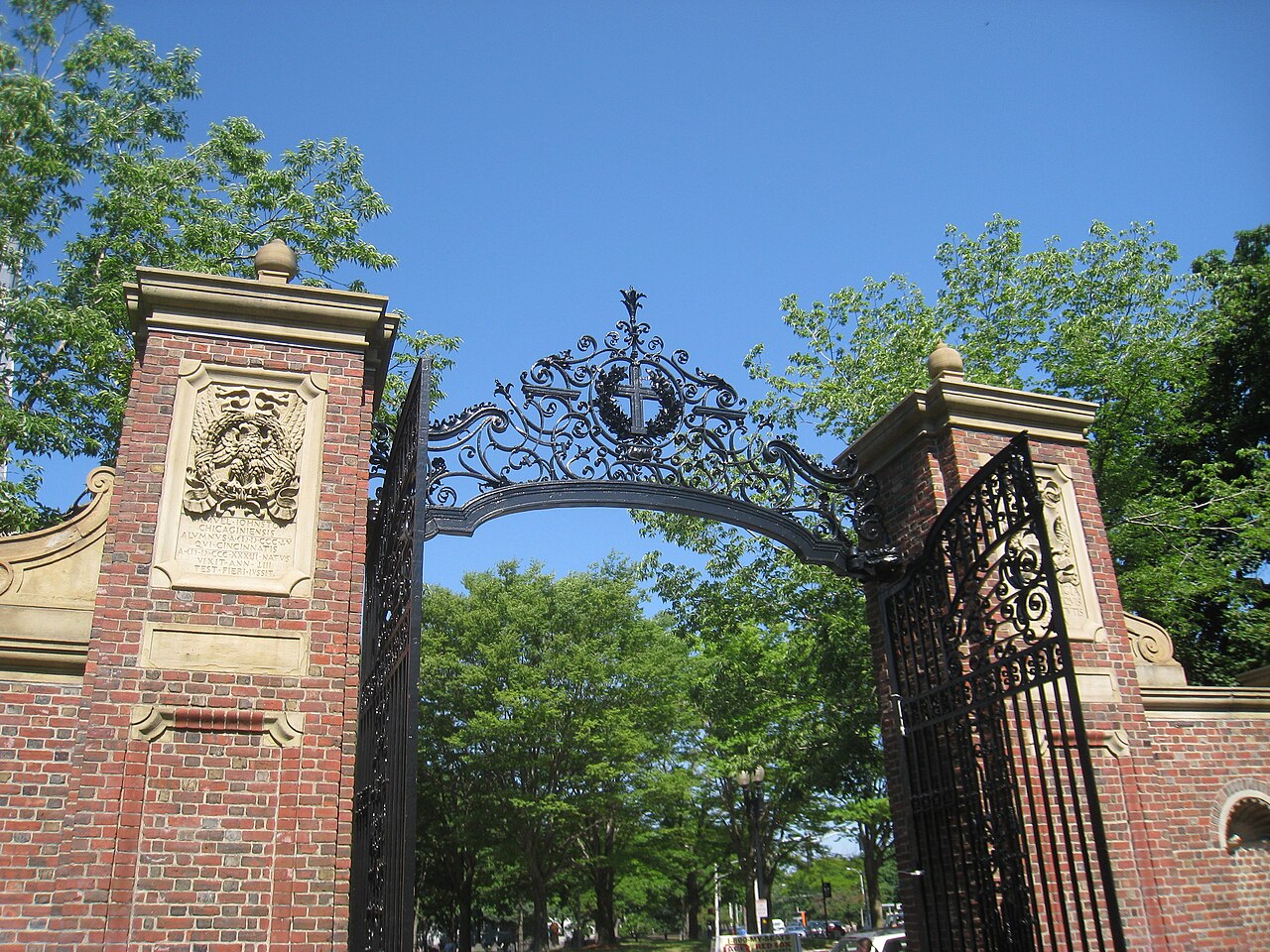
Campuses, statues and the stories they tell
The last two forces are physical, and both are harder to control than a style guide.
Place and buildings
Singapore Management University, founded in 2000 with curriculum help from the Wharton School, made location its argument. In 2005 it moved from Bukit Timah into the city centre at Bras Basah, into what is described as Singapore’s first purpose-built city campus. For a business school, being a short walk from the offices where graduates hope to work is a positioning statement in concrete.
NTU did something similar with architecture. The Hive, its learning hub designed by Thomas Heatherwick, gave a technical university known for engineering an image that travels on Instagram. A building can do in one photograph what years of brochures cannot.

Symbolic controversy
Symbols cut both ways. In March 2015, students at the University of Cape Town began protesting a statue of Cecil Rhodes on campus. A month later, on 9 April, the statue was removed after a council vote, and the Rhodes Must Fall movement spread to Oxford, where Oriel College voted in 2020 to seek removal of its own Rhodes statue. Whatever one’s view, the episode showed that a university’s physical symbols are read as statements of values, and that what a campus chooses to display is part of its brand whether the communications team likes it or not.
Architecture: the Yale-NUS lesson
Universities are also portfolios. Business schools, law schools, medical schools and partner colleges all want their own identity, and the parent wants coherence. The New School in New York handled this elegantly when it commissioned Pentagram to build an identity around a custom typeface, Neue, drawn in three widths, with school names such as Parsons set in red beneath a black wordmark. Each school could stand alone or be endorsed by the parent.
Singapore offers a sharper lesson in what happens when a sub-brand is built around a partner. Yale-NUS College was launched in 2011 by NUS and Yale and took its first class of 157 students in 2013. It carried two of the strongest names in higher education. In August 2021 NUS announced it would close, folding it with the University Scholars Programme into what became NUS College. The last class graduated and the college formally closed on 30 June 2025. The announcement drew criticism over how few people were consulted.
The branding lesson is not about whether the decision was right. It is that a co-branded institution borrows equity from both parents, and that equity is only on loan. When the partnership ends, the borrowed half of the name goes with it.
The credibility nobody else can borrow
Here is a small, revealing habit of the start-up world. Founders who want instant credibility splash university crests across their landing pages, under some line about being used by students at top institutions. Plenty of technical readers find the practice faintly scammy, and some point out that in much of Europe using a university’s mark without written permission would be unacceptable. The irony is sharp. Those same technical audiences often mock academic logos as generic, a sea of Oxbridge-flavoured shields. Yet nobody borrows a fintech’s logo to look trustworthy. They borrow a university’s.
That is the real asset. Not distinctiveness, at which most university identities are poor, but trust. An old university that keeps its old symbol signals quiet confidence. Constant rebranding signals a need for attention.
For anyone advising a university, three practical moves follow.
First, audit before you design. Ask who owns the current symbols emotionally, which groups use unofficial versions, and what the seal legally does. Exeter’s sports clubs could have told the university in 2005 what it learnt in 2022.
Second, separate the jobs. Ceremony, recognition and campaign communications need different tools. A crest, a simplified emblem and a flexible typographic system can coexist; The New School shows how far a typographic system alone can stretch.
Third, put the money where the reputation is made. Picture a mid-sized private college in Singapore with a budget of S$200,000. Spent on a new logo, it buys a fortnight of complaints. Spent on graduate outcomes data, an industry partnership with a visible campus presence and a sharper story about what the college teaches that others do not, it buys a reason to choose.
Questions from the admissions office
What is university branding?
University branding is the management of a higher-education institution’s name, symbols, reputation and student experience so that its many audiences understand what it stands for. It covers rankings, research reputation, campus, graduate outcomes and visual identity, not just the logo.
Why do universities keep returning to crests?
Alumni and students treat the crest as part of their own identity because a degree is permanent. Exeter brought back a revamped crest in 2022 and Warwick did the same in 2025 after earlier modern marks proved unpopular.
How do NUS and NTU differ in branding?
NUS leans on breadth and its position as Asia’s top-ranked university in the QS 2026 rankings, with arms that fuse its two founding institutions. NTU’s shield and image emphasise engineering and technology, reinforced by landmark architecture such as The Hive.
Before you touch the crest, start with a Firefish brand audit and find out who really owns it.