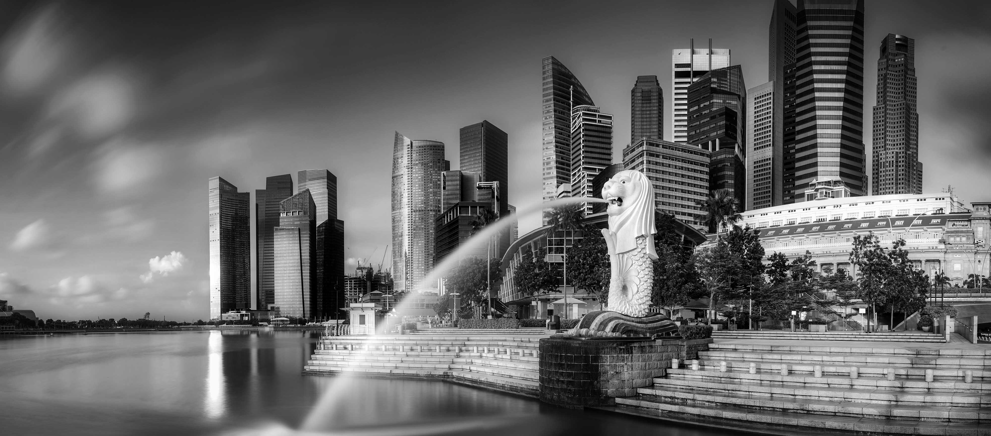
Throughout Singapore’s relatively short history, we have accrued many titles. For example, together with Hong Kong, South Korea and Taiwan, Singapore is known as one of the Four Asian Tigers, which were given much international attention throughout the 80s and early 90s for our economic growth and development.
Our present standard of living is a clear manifestation of our transition into a successful modern city state from our initial years. While the fruits of economic success can be easily seen all around us, what are some of the more visual and tangible symbols that have been associated with Singapore? Let us take a look together at three quintessential Singapore brand symbols that define us and their underlying brand attributes.
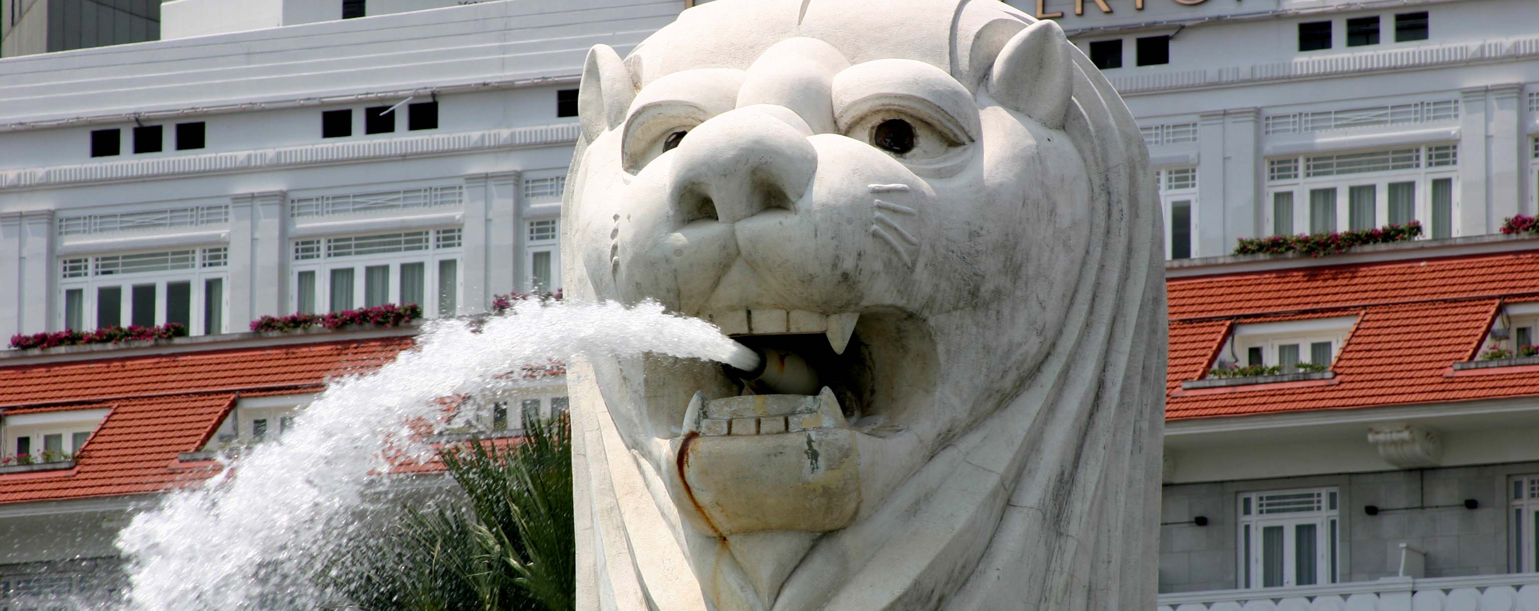
The Merlion
“Singapore needs a symbol that tourists can easily grasp, remember and associate with; Paris has the Eiffel Tower, New York its Statue of Liberty… so we created a new symbol – a logical extension of the Lion City idea. Not a lion but a merlion, a creature with a lion’s head on a fish’s body.” – Mr Lam Peng Loon, Director of the Tourist Promotion Board (1968 – 1976)
Originally conceived in 1972, our Merlion has come a long way since its murky origins. Some pundits regard him as a bastard child of Sang Nila Utama’s Singa and a mermaid. Fast forward to the present day, the Merlion is ridiculously popular with tourists and its foreign appeal is perplexing to most Singaporeans. The original Merlion is a pilgrimage site for “I came, I saw, I took photos” moments.
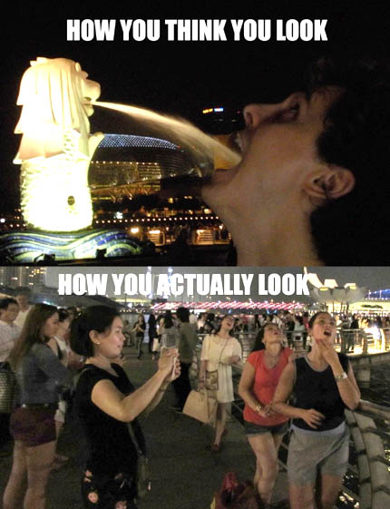
Veni, Vidi, Vici the Merlion
More than 40 years after its conception, the Merlion is still going strong. It can be found on $10 bucks T-shirts in Chinatown, on foreign chocolates, hybrid keychain thermometers, dry academic tomes, and a whole host of other Merlion themed memorabilia. The ubiquitous Merlion is found on almost every tourist souvenir category!
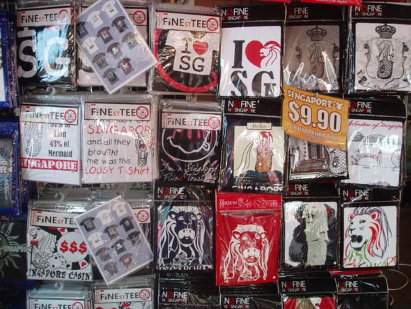
Merlion T-shirts at $9.90 in Chinatown
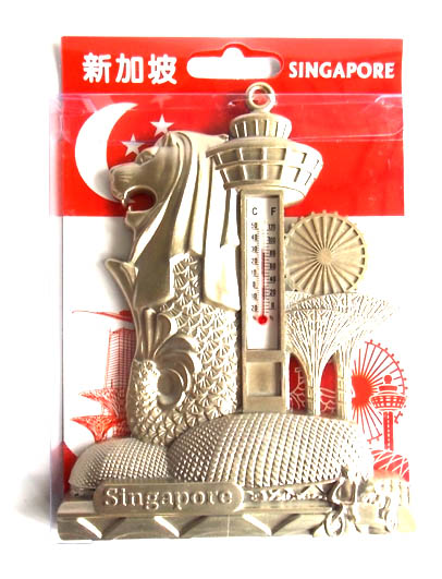
The Merlion with Other Popular Tourist Symbols
And the Japanese took the Merlion to another level altogether. They absolutely adore the Merlion. They can’t resist frolicking with the Merlion:
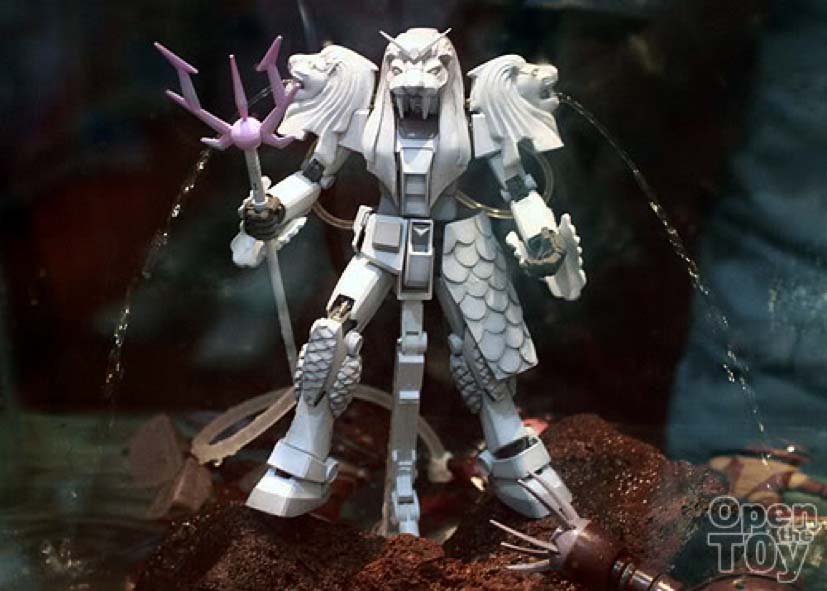
Limited edition Three-Headed Merlion Gundam by Bandai
Beyond merely a marketing or tourist icon, the Merlion resonates with a fundamental aspect of national psyche—pragmatism. Remember, the tourist board simply needs a symbol to sell. Local poet Lee Tzu Pheng affirms: (The Merlion is) “the instant brainchild of a practical people”.
Our pragmatism (not idealism) has made us who we are today. Yes, we might not be very funny. But we sure are no one’s dummy. Our pragmatism has brought us to where we are today, and made us known throughout the world with the Merlion no less. The underlying brand attribute of our Merlion symbol is in fact street-smart pragmatism. And it sells really well.

Garden City
“To ensure that high standards of cleanliness were maintained, new laws would be introduced to:
1. Require every shop and house to have a dustbin.
2. Increase considerably the fines for creating rubbish and litter”
An excerpt from S’pore to become beautiful, clean city within three years, Straits Times, 12 May, 1967
The guidelines for increasing fines and mandating every shop and house to have a dustbin may seem like common sense now. However, such was not the case back in 1967. The Garden City vision of Singapore as a litter-free beautiful city abundant with flowers and trees was introduced by then PM Lee Kuan Yew. And it featured two distinct phases: the clean-up phase and the subsequent education and maintenance phase.
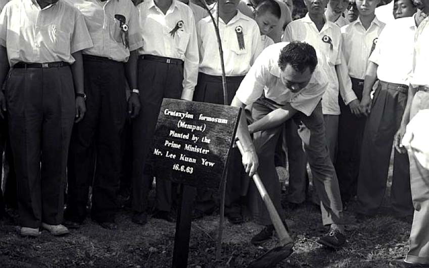
PM Lee Kuan Yew Planting a Tree
The Garden City vision, apart from making life more pleasant, would also “reinforce Singapore’s good reputation abroad.” The fact that new laws had to be passed implied that Singapore did not always enjoy a reputation for being “clean”. The point was reiterated by an article on the 13th of May, 1967 by the Straits Times that,
“Such measures alone would not be enough to change the habits of people accustomed virtually to letting rubbish lie wherever it may fall. As Mr Lee said, there must be education—and a lot more.”
– An excerpt from Garden City, Straits Times, 13 May, 1967
Fast forward to contemporary Singapore, every visitor will proclaim Singapore as “clean” when asked for an impression. And interestingly enough, there is another line towards understanding “clean” in the Singaporean context. Something that is just as vital to our identity as being sanitary.
We have a reputation for being clean and we came in seventh in Transparency International’s 2016 Corruption Perception Index. Through a mixture of transparency, good governance, stringent enforcement and corporal punishment, we have flipped the corruption-to-profit ratio from a “low risk, high reward” to a “high risk, low reward” equation which fits nicely into the pragmatic mindset. In short, it doesn’t pay to be dishonest.
So when the label “clean” is being used in Singapore, it possesses a double meaning: an immaculate Garden City as well as a principled and trustworthy people. Nothing beats the simple word, “clean” which means a lot of things to everybody. The physical manifestation of the Garden City symbol becomes the personification of our brand attribute of cleanliness.
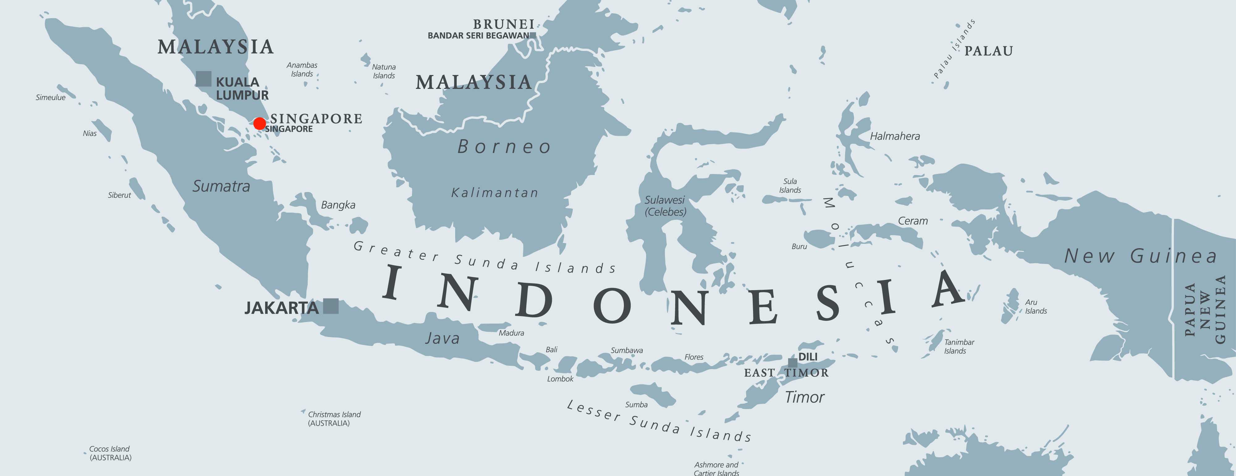
Little Red Dot
“It’s OK with me, but there are 211 million people (in Indonesia)… Look at that map. And that red dot is Singapore. Look at that.” – B.J Habibie, President of Indonesia (1998 – 1999)
Alleged to have painted a “less then cordial” image of Singapore with regards to our petite “size”, Habibie has since spent many years explaining to no avail that his remark has been taken out of context.
Technically speaking, the title of little dot stands true. For on numerous maps, Singapore does appear as a little dot in comparison to the humongous mess mass that is Indonesia. Whether Habibie meant to disparage Singapore or not is besides the point. For the “Little Red Dot” reputation was lapped up and glorified by the Press and the media. Another subtle manifestation of our national psyche is we are creative. Very creative. Ingeniously so.
Taking things in stride, we have embraced the “free publicity” and turned it into an integral aspect of our national brand. Our physical condition does not hamper our aspirations. Instead it is a virtue to be celebrated. Amidst the Asian Financial Crisis of 1997 – 1998, then PM Goh Chok Tong, responded with relish in his 23rd August 1998 National Day Rally Speech,
“Singapore will help Indonesia within the limits of our ability. We are a small economy. We are not in the same class. After all we are only three million people. Just a little red dot on the map. Where is the capacity to help 211 million people?”
As more and more people started to use the red dot to refer to Singapore, the term took on new meanings and new life. In short, it went viral. Akin to the Merlion, the ubiquitous “Little Red Dot” was adopted by many as a title in their businesses; inclusive but not limited to a hair salon, hostel, Montessori, advertising agency, training center, gift shop, pub, and even Hainanese curry rice.
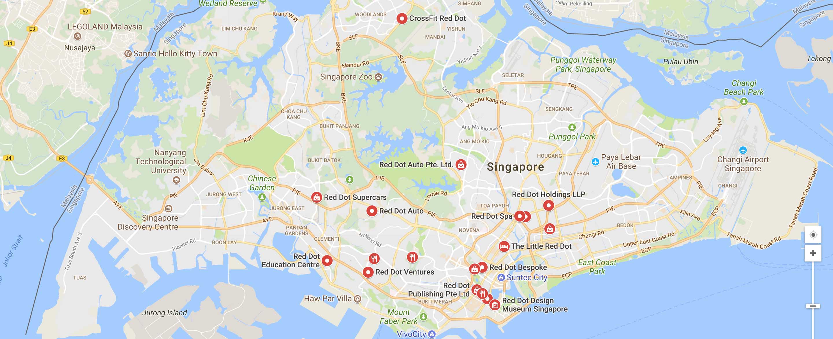
Red Dots Within The Little Red Dot
Truly, we are the Red Dot nation. The Red Dot symbol may have the brand attribute of minuscule in size but it also possesses the brand attribute of powerful. Singapore has become known as a small but powerful and rich nation state. The Red Dot ultimately is an oxymoron: dot as small but red as a significant nation in the big, big world out there.
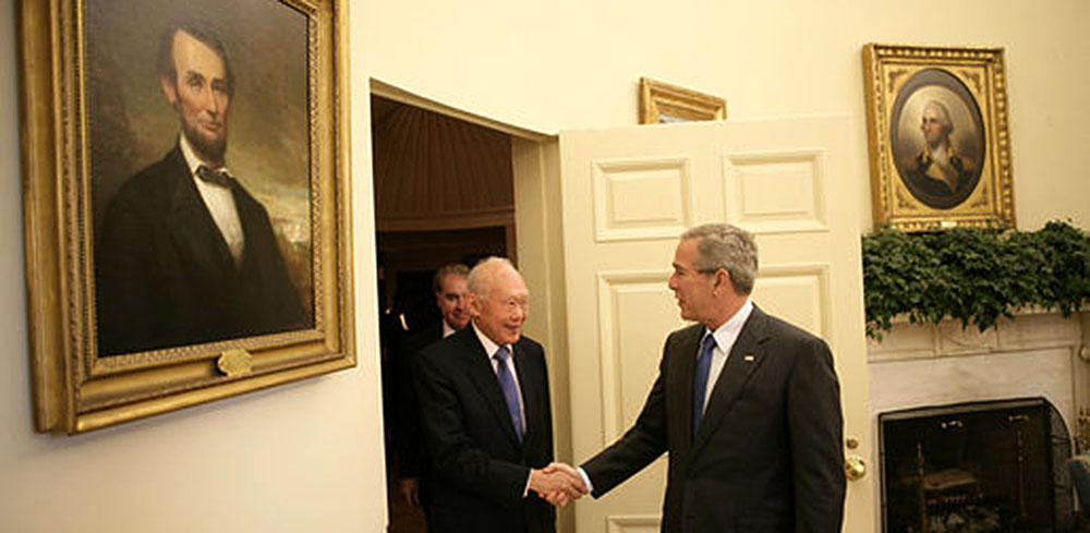
LKY aka Lee Kuan Yew
We know that Lee Kuan Yew (abbreviated as LKY) is held in high esteem by foreign dignitaries. We also know that he is regarded with reverence among most Singaporeans. But do you know that he is popular in rural India as well?
Named after Singapore’s first Prime Minister, little Lee Kuan Yew Jayaprakash lives in Mannargudi, Tamil Nadu, the southern most part of India, almost 3,000 km away from Singapore.
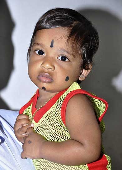
Lee Kuan Yew Jayaprakash
Many from the town have forged strong links with Singapore. According to one Bagya of Parvakottai from the town, “At least one person in every family here is either working in Singapore or has worked there. This has helped entire families to build a better life.” And no prizes for guessing who the residents of Mannargudi attribute the success of Singapore, and their own subsequent success to—the legendary brand symbol that represented Singapore to the rest of the world for over three decades, Lee Kuan Yew.
Meanwhile almost 4,000 km up north, there is a restaurant in Shanghai with a concise name – LKY’s Kitchen.
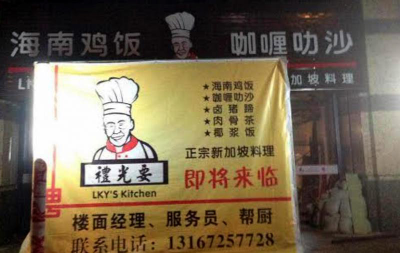
LKY Kitchen in China
The word play in Mandarin on Lee Kuan Yew’s Mandarin name characters changes the characters from 李光耀 to 礼光要.This is the brainchild of Singaporean entrepreneur—Mr Jason Yap. He intended his restaurant to be known in Shanghai for its authentic Singapore food. He tapped into a common Chinese tradition of “naming shops and restaurants with similar sounding names as prominent Chinese leaders, such as Wen Jiabao (former Premier of China).”
Taken in context, the LKY brand symbol represents many things depending on whom you ask. Folks from Mannargudi associate it with success. For hungry Chinese in Shanghai, it means Singapore albeit with a touch of humour and play. Indeed, the LKY brand name has become synonymous with the country, Singapore.
It also reveals how we prefer to associate brands with personas, and this is also applicable for countries and their respective leaders. The brand of Singapore is ultimately attributed to its instrumental leader, LKY. And together, they represent brand attributes of pragmatic, small yet ambitious and “clean”.
Like any other brand, the Singapore brand is imbued with many brand symbols and from these symbols emanate different brand attributes. This Singapore brand has built considerable brand equity over the years and gained its fair share of admirers as well as critics. But one thing is for sure, the Singapore brand needs to be reinforced and built further in order to stand the test of time and grow in global prominence.


