In the complex legal world where ambiguities are rife, we discovered the most elegant solution for WhiteFern.
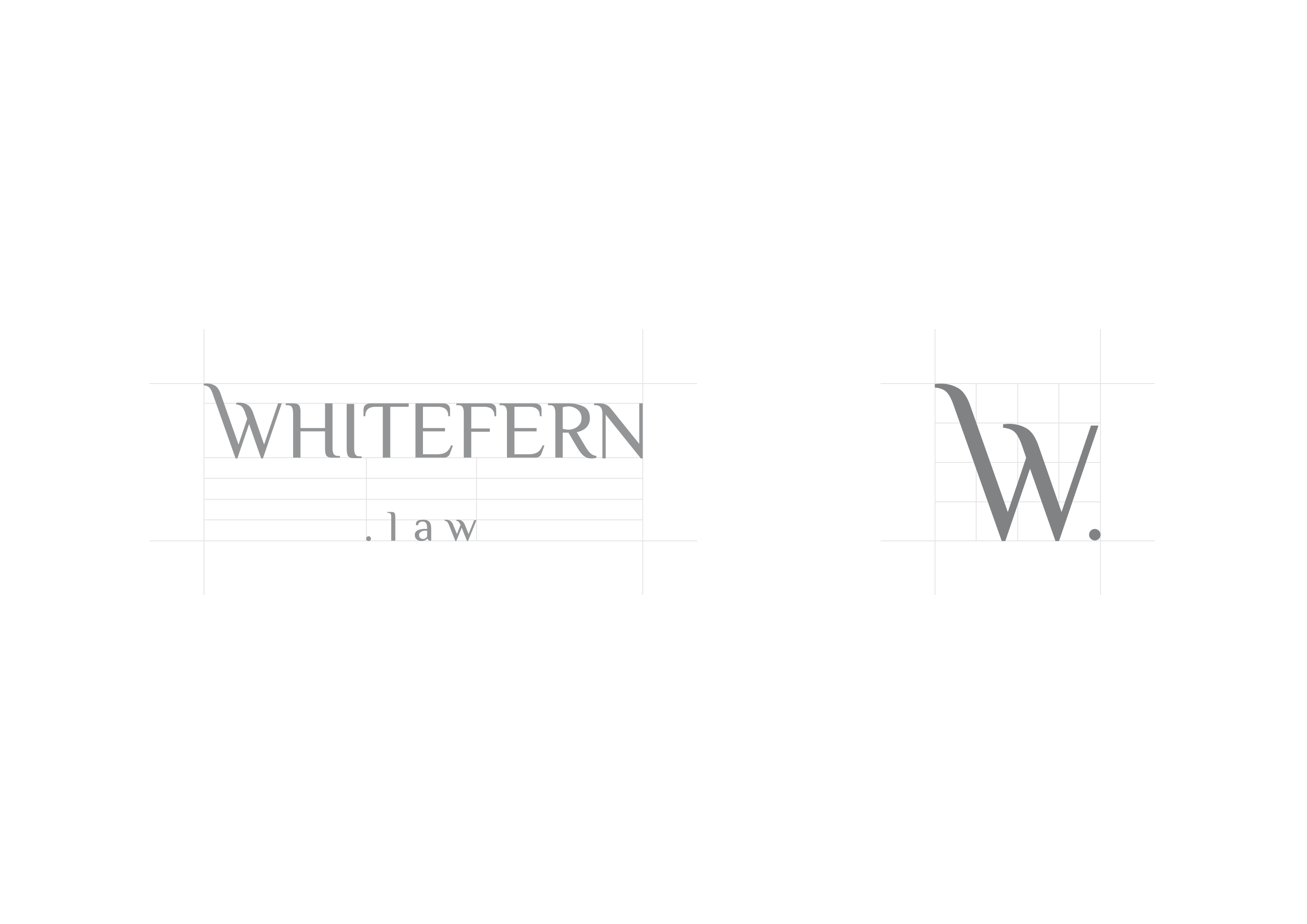
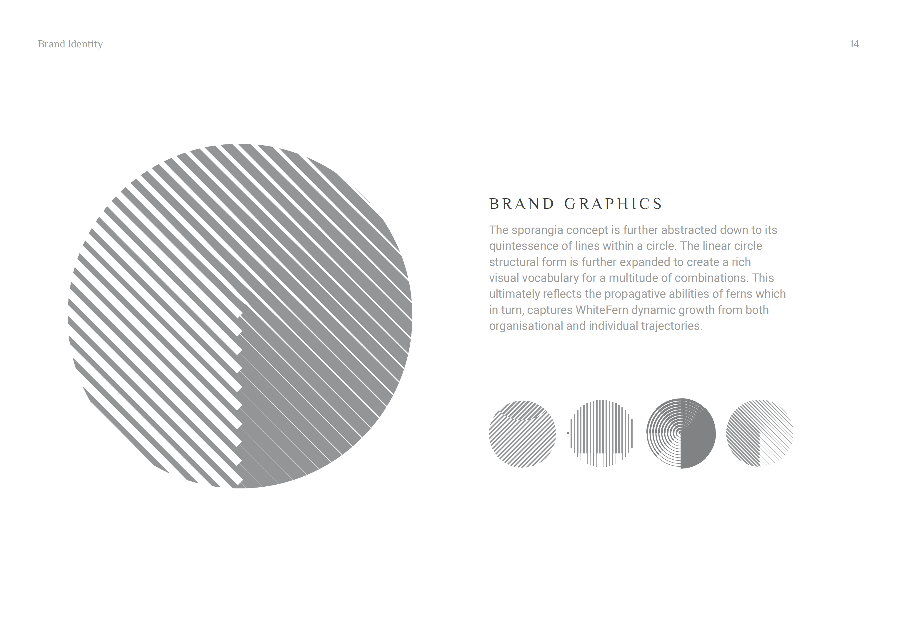
The "W" ascender extending beyond its cap height coupled with the growing serifs of letters capture the organic growth of ferns, thus appropriately echoing the brand name. The top-level domain ".law" reflects the domain name, "whitefern.law", while anchoring the business vertical and acting as a counterbalancing visual device for the logotype. A secondary visual library of circles and lines is an abstraction of the sporangia growing underside of ferns, thus reflecting the productive qualities of both organisation and individuals. Everything is washed in shades of grey with the key brand colour as 50% grey to ultimately portray the impartiality of the legal system.